Example data set is iris. Iris dataset is a dataset with measured values for Sepals and petals (width and length) for 3 plant species.

$ data(iris)
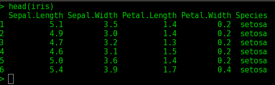
$ head(iris) ## prints the first few lines of iris data
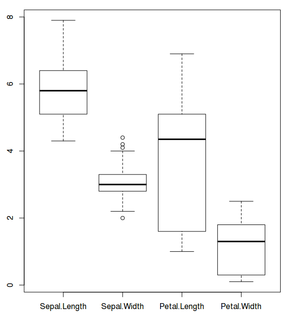
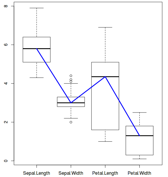
$ boxplot((iris)[,c(1:4)]) ## Draws a box plot for lengths and widths of sepals and petals of 3 species
$ lines(1:4,(boxplot((iris)[,c(1:4)]))$stats[3,], col="blue", lwd=3)
$ (boxplot((iris)[,c(1:4)]))
prints all the statistics of the boxplots under 6 categories.
For plotting lines, we need statistics output from the boxplot under $stats category. Stats ($stats) contain 5 values for each variable (i.e for each box). They are lower whisker, the lower ‘hinge’, the median, the upper ‘hinge’ and the extreme of the upper whisker. We need median which is why the argument: stats$[3,]. Line color is blue and line width is 3.
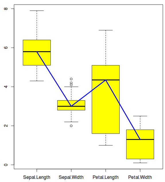
Now let us give some contrast color to the boxes.
$ lines(1:4,(boxplot((iris)[,c(1:4)], col="yellow"))$stats[3,], col="blue", lwd=3)
Now let us draw the same in ggplot:
ggplot doesn't allow drawing box plots as easy as basic plotting system (as I understand). So let us first format the data frame. In R parlance, it is called reshaping or melting the data frame from wide format (iris data original format) to long format, using reshape2 package (melt function).
$ library(reshape2)
$ iris_melt=melt(iris, id.vars='Species')
## Before melting
head(iris)
$head(iris_melt)
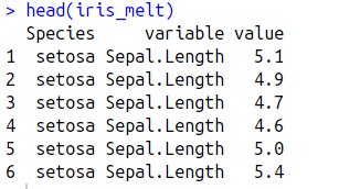
Melt (in reshape2) function collapses the data frame by Species name and creates one single column (named "variable") for all the variables (Sepal length, sepal width, petal length, petal width) in iris data frame. Corresponding values will be present in a third column (name "value").
Now let us draw the box plots in ggplot:

stat_boxplot(geom="errorbar", width=.5)+
geom_boxplot()+
theme_bw()+
theme(axis.title.x=element_blank(), axis.title.y=element_blank())
What is happening here:
1) Variable and value are plotted on x and y axis
2) Error bars are added at the top (using function stat_box_plot. Box plot function in ggplot doesn't add error bars on the top of boxplots like basic box plot does)
3) Box plots are added
4) Default grey theme is overridden by black and white theme
5) x and y axis labels (variable and value) are hidden.
Now let us add color to the box plot:$ggplot(iris_melt, aes(variable,value)) +
stat_boxplot(geom="errorbar", width=.5)+
geom_boxplot(fill="yellow")+
theme_bw()+
theme(axis.title.x=element_blank(), axis.title.y=element_blank())
geom_boxplot(fill="yellow")+
theme_bw()+
theme(axis.title.x=element_blank(), axis.title.y=element_blank())
Now that we added color, let us add line connecting the medians (in blue color)
$ ggplot(iris_melt, aes(variable,value)) + stat_boxplot(geom="errorbar", width=.5)+
geom_boxplot(fill="yellow")+
theme_bw()+
theme(axis.title.x=element_blank(), axis.title.y=element_blank())+
stat_summary(fun.y=median, geom="smooth", aes(group=1), lwd=1)
what is happening here:
In last step, we have defined function median. If we want, we can include mean to connect means instead of median. aes(group=1) argument means that you want one line to connect the dots (http://stackoverflow.com/questions/10357768/plotting-lines-and-the-group-aesthetic-in-ggplot2). However, since median is only one point, aes(group=1) works even if it (group) is 10 or 0. May be ggplot creators have valid explanation for this. I don't.aes argument is necessary here.
Now that we created boxplots, let us add data points as well to the box plot.

$ggplot(iris_melt, aes(variable,value)) +
stat_boxplot(geom="errorbar", width=.5)+
geom_boxplot(fill="yellow")+
theme_bw()+
theme(axis.title.x=element_blank(), axis.title.y=element_blank())+
stat_summary(fun.y=median, geom="smooth", aes(group=0),lwd=1)+
geom_jitter(position = position_jitter(0.2))
Now let us do the same thing in basic plot system i.e plot values over the box plots:

$ lines(1:4,(boxplot((iris)[,c(1:4)], col="yellow"))$stats[3,], col="blue", lwd=3)
$ stripchart((iris)[,c(1:4)], add=T, method = "jitter", jitter = 0.2, vertical = T, pch=16)
What is happening here:
We have added data points over the box plots using strip chart function. add argument allows the user to add stripchart over box plots. vertical argument allows the user to plot points vertically. pch argument is for filled circles.
Now let us say, you want to draw boxplots for each species and for all the four variables (sepal lengths and widths, petal lengths and widths) as below:

$ ggplot(iris_melt, aes(variable,value)) +
stat_boxplot(geom="errorbar", width=.5)+
geom_boxplot(fill="yellow")+
theme_bw()+
theme(axis.title.x=element_blank(), axis.title.y=element_blank())+
stat_summary(fun.y=median, geom="smooth", aes(group=0),lwd=1)+
# geom_jitter(position = position_jitter(0.2),col="red")+
facet_grid(. ~ Species)
What is happening here:
We added the argument to display as per species vertically (column wise).Now, let us do the same thing in basic plot:

$ par(mfrow=c(1,3))
$lines(1:4,(boxplot(iris[iris$Species=="setosa",][,c(1:4)],xlab="Setosa",col="yellow"))$stats[3,], col="blue", lwd=3)
$lines(1:4,(boxplot(iris[iris$Species=="virginica",][,c(1:4)],xlab="Virginica", col="yellow"))$stats[3,], col="blue", lwd=3)
$lines(1:4,(boxplot(iris[iris$Species=="versicolor",][,c(1:4)], xlab="Versicolor", col="yellow"))$stats[3,], col="blue", lwd=3)
$lines(1:4,(boxplot(iris[iris$Species=="virginica",][,c(1:4)],xlab="Virginica", col="yellow"))$stats[3,], col="blue", lwd=3)
$lines(1:4,(boxplot(iris[iris$Species=="versicolor",][,c(1:4)], xlab="Versicolor", col="yellow"))$stats[3,], col="blue", lwd=3)