Despite the quality of output, ggplot is a pain in the neck (for beginners) and the error messages are as useful as investor tips on cable. One of the requests i got recently was to plot data into alternate colours for chromosomes. It is very easy to color as per chromosome (factor/Type). In addition, geom_rect is literally pain in the neck to draw. In this note, we will simulate a dataframe for 10 chromosomes, with start and stop for each heterozygocity value. The frame will have 1-10 chromosomes (factor), start and stop coordinates (integers/numbers) and heterozygocity values (floats). Let us get the elephant out first, elephant here is dataframe simulation:
df1 = data.frame(
chromosome = as.factor(rep(
1:10, 100, each = 10, replace = T
)),
start = round(1:10000),
stop = round(20:10019),
hetero = sample(c(
runif(9000, 0.05, 0.2), runif(1000, 0.2, 0.6)
))
)
df1$col = ifelse(as.numeric(df1$chromosome) %% 2 == 0, 0, 1)
================
Data structure and few lines from the data are given at the end. First, draw a scatter plot ( I removed all axis labels, legends and axes):
code:
==========================
ggplot(df1, aes((start + stop) / 2, hetero)) +
theme_void() +
theme(
axis.text.x = element_blank(),
axis.ticks.x = element_blank(),
legend.position = "none"
) +
geom_point(aes(colour = factor(col))) +
scale_colour_manual(values = c("steelblue", "lightblue"))
==============================
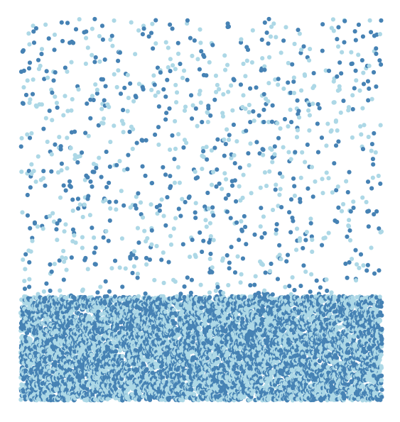
Now we have plotted heterozygosity values against average value of start and stop of chromosome. Odd and even chromosomes are colored steelblue and lightblue. These values (for odd and even chromsomes) come from col column in simulated data frame. We have assigned 1 and 0 to even and odd chromosomes. Let us now break the graph into per chromosome values by faceting.

code:
==================================
ggplot(df1, aes((start + stop) / 2, hetero)) +
facet_grid(. ~ chromosome) +
theme_void() +
theme(
axis.text.x = element_blank(),
axis.ticks.x = element_blank(),
legend.position = "none"
) +
geom_point(aes(colour = factor(col))) +
scale_colour_manual(values = c("steelblue", "lightblue"))
======================================
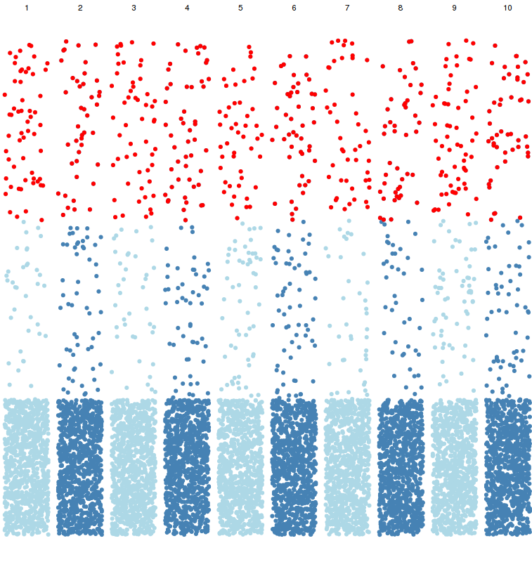
Now we have segregated the data per chromosome, now let us highlight the heterozygocity data by filtering heterozygous value above 0.4, with red color.
code:
====================
ggplot(df1, aes((start + stop) / 2, hetero)) +
facet_grid(. ~ chromosome) +
theme_void() +
theme(
axis.text.x = element_blank(),
axis.ticks.x = element_blank(),
legend.position = "none"
) +
geom_point(aes(colour = factor(col))) +
scale_colour_manual(values = c("steelblue", "lightblue")) +
geom_point(data = df1[df1$hetero > 0.4,], aes((start + stop) / 2, hetero), colour ="red")
===================================
Now we have highlighted the filtered values with red color. We already highlighted data by chromosome and gave alternate color patterns to all the data points. Now let us give alternate colors to each chromsome background

.Now as you see, each chromosome has alternate color as background and each data point has alternate color.
code:
==========================
ggplot(df1, aes((start + stop) / 2, hetero)) +
facet_grid(. ~ chromosome) +
theme_void() +
theme(
axis.text.x = element_blank(),
axis.ticks.x = element_blank(),
legend.position = "none"
) +
geom_rect(aes(
xmin = min((start + stop) / 2),
xmax = max((start + stop) / 2),
ymin = -Inf,
ymax = +Inf,
fill = factor(col)
),
alpha = 0.2) +
scale_fill_manual(values = c("grey90", "white")) +
geom_point(aes(colour = factor(col))) +
scale_colour_manual(values = c("steelblue", "lightblue")) +
geom_point(data = df1[df1$hetero > 0.4, ], aes((start + stop) / 2, hetero), colour ="red")
============================
Note that geom_rect comes first, scatter plot comes next. This is because of R is lazy and executes code in order. Hence first it draws background, then it plots the points. Otherwise, it would draw the points first and then will overdraw the background on data points.
Now let us look at the input dataframe (code to simulate the data frame is given after ggplot code):
> head(df1)
chromosome start stop hetero col
1 1 1 20 0.11914874 1
2 1 2 21 0.17624770 1
3 1 3 22 0.06668591 1
4 1 4 23 0.15027210 1
5 1 5 24 0.08287389 1
6 1 6 25 0.05106764 1
Let us look at the structure of dataframe df1:
> str(df1)
'data.frame': 10000 obs. of 5 variables:
$ chromosome: Factor w/ 10 levels "1","2","3","4",..: 1 1 1 1 1 1 1 1 1 1 ...
$ start : num 1 2 3 4 5 6 7 8 9 10 ...
$ stop : num 20 21 22 23 24 25 26 27 28 29 ...
$ hetero : num 0.1191 0.1762 0.0667 0.1503 0.0829 ...
$ col : num 1 1 1 1 1 1 1 1 1 1 ...