It is pretty common that biologists compare expression patterns between two conditions for genes. There are several ways to display expression patterns between conditions. However they are good in displaying overall (for all genes) expression patterns. If one draws difference for each gene, it would look messy. There are other ways to show the differences. For eg lollipop plots.They are called lollipop plots as output looks like bunch of lollipops in sand.
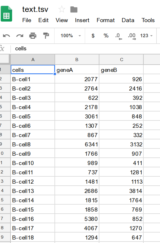
Let us take an example data and then produce lollipop plot. You can download dummy data from here. Data screen shot:
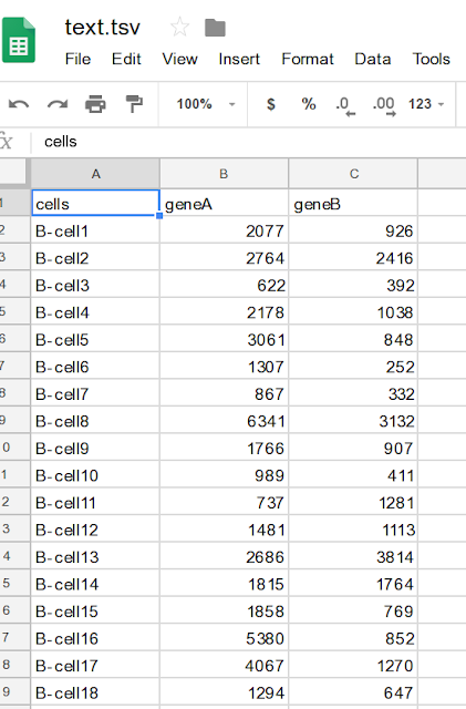

Let us take an example data and then produce lollipop plot. You can download dummy data from here. Data screen shot:
Now user wants to plot each gene value next to each other for each cell. Let us do it in ggplot2 package. Data needs some rearrangement. Please note that I plotted only first 20 lines (head).
===================
$ suppressPackageStartupMessages(library(dplyr))
$ suppressPackageStartupMessages(library(tidyr))
$ suppressPackageStartupMessages(library(ggplot2))
$ df1=read.csv("text.tsv", strip.white = T, stringsAsFactors = T,sep="\t")
$ df2=head(df1,20) %>%gather("gene","expression", -cells) %>% arrange(gene,expression) %>% mutate (cells = factor(cells, unique(cells)))
$ df2$gene=as.factor(df2$gene)
$ ggplot(df2, aes(x=cells, y=expression)) +
geom_point(aes(color=gene, size=3), position=position_dodge(width=.6))+
geom_linerange(aes(ymin=0, ymax=expression,color=gene),position = position_dodge(.6))+
theme_bw()+
theme(
legend.position = "none",
panel.grid.major = element_blank(),
panel.grid.minor = element_blank(),
axis.text.x = element_text(margin=margin(t=20),size=12,angle = 45),
axis.text.y = element_text(size=18),
axis.title.y = element_text(size=18),
axis.title.x = element_text(size=18))+
scale_color_manual(values=c("darkgreen", "red"))+
ylab("Expression")+
xlab("Cells")
=================================
