One of the requests I got was to plot unbalanced data between two groups as bar plot in ggplot as percentages. Let us do this after simulating data
set.seed(100)
df<- data.frame(
    PID = 1:12,
    Treatment = sample(c("A", "B"), 12, replace = TRUE) ,
    Drug = sample(c("Yes", "No"), 12, replace = TRUE)
)
df
##    PID Treatment Drug
## 1    1         B   No
## 2    2         A   No
## 3    3         B  Yes
## 4    4         B   No
## 5    5         A   No
## 6    6         A  Yes
## 7    7         B  Yes
## 8    8         B  Yes
## 9    9         B  Yes
## 10  10         A   No
## 11  11         B   No
## 12  12         B  Yes
Now let us create percentage table using prop.table and xtabs function.
df2=as.data.frame(100*prop.table(xtabs(~Treatment+Drug, data=df)))
df2
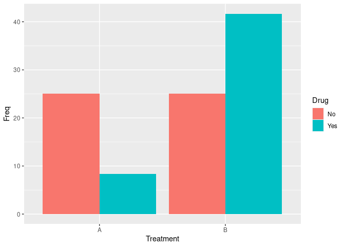
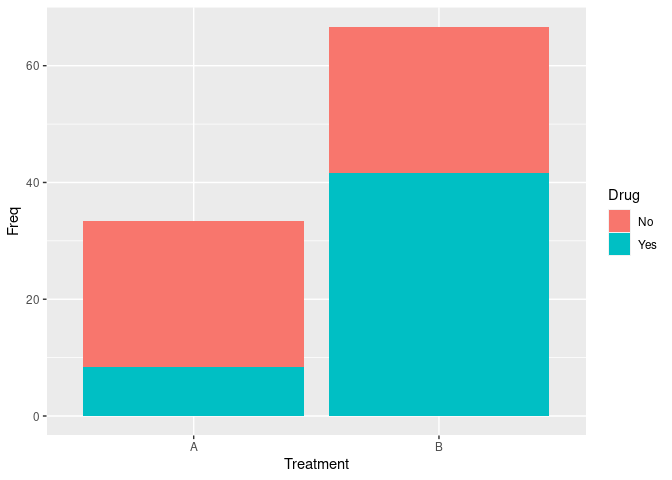
##   Treatment Drug      Freq
## 1         A   No 25.000000
## 2         B   No 25.000000
## 3         A  Yes  8.333333
## 4         B  Yes 41.666667
let us plot the data
library(ggplot2)
ggplot(df2, aes(Treatment, Freq, fill = Drug)) +
    geom_bar(stat="identity")
Let us say you want to have them next to each other. Use “dodge” in geom_bar function
library(ggplot2)
ggplot(df2, aes(Treatment, Freq, fill = Drug)) +
    geom_bar(stat="identity", position = "dodge")