Volcano plot
Volcano plot is not new. In the era of microarrays, they were used in conjunction with MA plots. Volcano plot is a plot between p-values (Adjusted p-values, q-values, -log10P and other transformed p-values) on Y-axis and fold change (mostly log2 transformed fold change values) on X-axis. Then one adds all kinds of decorations to plot like cut-off lines so and so forth. In this note, we will use basic plotting and ggplot2 to plot volcano plots. You can download the input file from here and the data has 3 columns: Gene names, Fold change (log2) and Adjusted p values (FDR). File is comma separated.Basic plotting
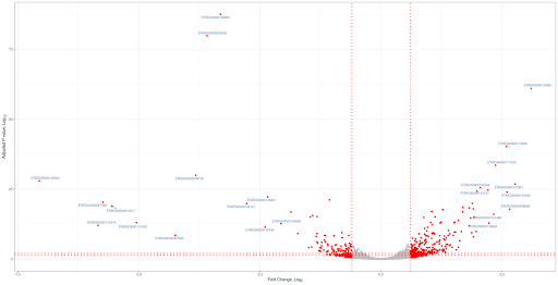
Plot will have fold change (log2) values on x-axis and adjusted p values (FDR) (-log10 scale) will be on Y-axis. Significant genes are upregulated or downregulated by 1.5 times (log 2 scale 0.6). Non-siginficant genes are hightlighted in grey color and significant genes are highlighted in red color. Genes are labeled with grey color. FDR cut off value is 0.05. Let us jump into the code. Red lines represent cut offs. P value cut offs (0.01 and 0.05) are log transformed.================================================================
# Load the data
df=read.csv("ggplot_test.txt", header = T, stringsAsFactors = F, strip.white = T)
# Remove the empty lines
df=na.omit(df)
# Plot the x and y axis with fold change and -log10 pvalues
with(df,
plot (FoldChange_log2, -log10(padj),
col = "darkgrey",
pch = 19,
cex=2,
xlab=expression("Fold Change, Log"[2]*""),
ylab=expression("Adjusted P value, Log"[10]*""),
abline(v=c(-0.6,0.6),h=c(-log10(0.01),-log10(0.05)), col="red", lty=3,lwd=3)))
# Highlight the genes of interest
with(subset(df,abs(FoldChange_log2) >= 0.6 & padj < 0.05 ),
points(
x = FoldChange_log2,
y = -log10(padj),
col = "red",
pch = 16,
cex=2))
# Label the genes with steel blue color
with(subset(df,abs(FoldChange_log2) >= 2 & padj < 0.05 ),
text(
x = FoldChange_log2,
y = -log10(padj),
Gene.names,
cex = 1,
pos=2,
col = "steelblue"
))
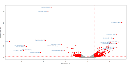
With ggplot2
===========================================================
suppressPackageStartupMessages(library(dplyr))
suppressPackageStartupMessages(library(ggplot2))
suppressPackageStartupMessages(library(ggrepel)) geom_point() +
xlab(expression("Fold Change, Log"[2]*"")) +
ylab(expression("Adjusted P value, Log"[10]*"")) +
geom_vline(
xintercept = c(-0.6,0.6),
col = "red",
linetype = "dotted",
size = 1) +
geom_hline(
yintercept = c(-log10(0.01),-log10(0.05)),
col = "red",
linetype = "dotted",
size = 1)+
theme_bw() +
theme(legend.position = "none")+
scale_colour_manual(values = c("grey", "red")) +
geom_text_repel(data=subset(df,abs(FoldChange_log2) >= 2 & padj < 0.05),
aes(FoldChange_log2, -log10(padj), label = Gene.names),size = 3, color="steelblue")
=======================================================