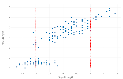
Plotly is a useful a graphing library available in python, R and other languages. One of the challenges for ggplot users is to add vertical and horizontal lines. It's a convoluted way in R compared to ggplot. Let us do it for iris data. We will take Sepal and petal lengths and draw a scatter plot. Though we are not making any scientific conclusions from the analysis, we will see how vertical lines are added to plotly graph.
======================================================
======================================================
# Load data iris
data (iris)# Create plotly object with iris data and sepal and petal length are to be compared against
fig=plot_ly(iris, x=~Sepal.Length, y=~Petal.Length)# Add markers to the object
fig <- fig %>% add_markers()# Add vertical lines as layout shapes. Vertical lines are red in color and dashed
fig <- fig %>% layout(shapes=list(
list(type='line', x0= 5, x1= 5, y0=min(iris$Petal.Length),
y1=max(iris$Petal.Length), line=list(dash='dot', width=3,color = "red")),Now look at the output:list(type='line', x0= 7, x1= 7, y0=min(iris$Petal.Length),y1=max(iris$Petal.Length), line=list(dash='dot', width=3,color = "red"))))# Plot the figurefig===========================================================On x-axis, Sepal length and on y-axis, petal length are drawn. Vertical lines are added as layout
shapes.