Ggplot despite being one of the best graphing systems in R, many newbies (esp biologists) struggle to understand the syntax. Here is a small tutorial for those who deal with gene expression data. Example data can be downloded from here.
Load libraries
library(ggplot2)
library(ggrepel)
Load example data
df=read.csv("ggplot_test.txt", header = T, strip.white = T, stringsAsFactors = F)
Remove NA
df=df[complete.cases(df),]
Order the data frame by adjusted p-values
df=df[order(df$padj),]
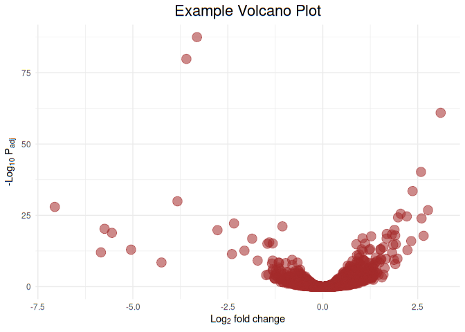
Let us plot Example Volcano Plot and give all points brown color
ggplot(df, aes(x=FoldChange_log2, y=-log10(padj), color=I("brown"))) +
    geom_point(aes(size=1.5, alpha=0.5)) +
    ggtitle('Example Volcano Plot') +
    labs(y=expression('-Log'[10]*' P'[adj]), x=expression('Log'[2]*' fold change')) +
    theme_minimal() +
    theme(legend.position="none", plot.title = element_text(size = rel(1.5), hjust = 0.5))
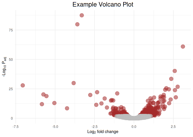
Now let us color highlight genes of statistical siginficance (padj< 0.01). Let us highlight the genes of statistical significance with brown and non-significant grey
ggplot(df, aes(x=FoldChange_log2, y=-log10(padj), color=I(ifelse(padj>0.01,"grey","brown")))) +
    geom_point(aes(size=1.5, alpha=0.4)) +
    ggtitle('Example Volcano Plot') +
    labs(y=expression('-Log'[10]*' P'[adj]), x=expression('Log'[2]*' fold change')) +
    theme_minimal() +
    theme(legend.position="none", plot.title = element_text(size = rel(1.5), hjust = 0.5))
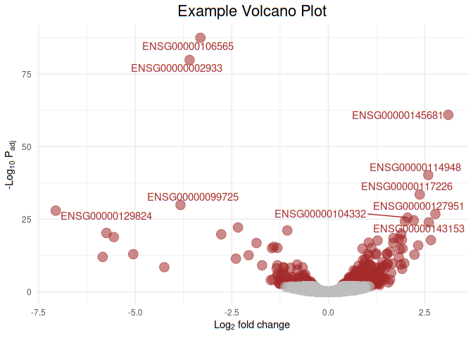
Now let us add labels to the top 10 statisticaly signficant genes
ggplot(df, aes(
    x = FoldChange_log2,
    y = -log10(padj),
    color = I(ifelse(padj > 0.01, "grey", "brown"))
)) +
    geom_point(aes(size = 1.5, alpha = 0.4)) +
    ggtitle('Example Volcano Plot') +
    labs(y = expression('-Log'[10] * ' P'[adj]),
         x = expression('Log'[2] * ' fold change')) +
    theme_minimal() +
    theme(legend.position = "none",
          plot.title = element_text(size = rel(1.5), hjust = 0.5)) +
    geom_text_repel(data = df[1:10, ], aes(
        x = FoldChange_log2,
        y = -log10(padj),
        label = Gene.names
    ))
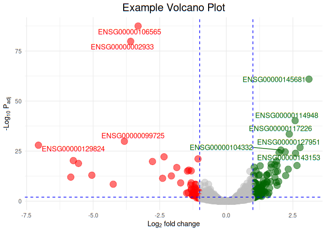
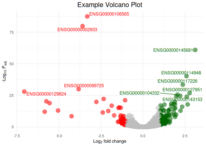
Now let us color upregulated genes with green color, and downregulated genes with red color, genes that do not show any color change as grey color. Hightlight top 10 regulated (up and down) genes with text
ggplot(df, aes(
    x = FoldChange_log2,
    y = -log10(padj),
    color = I(ifelse(FoldChange_log2 >= 1, "darkgreen", ifelse (FoldChange_log2 <= -1,"red","grey"))))) +
    geom_point(aes(size = 1.5, alpha = 0.4)) +
    ggtitle('Example Volcano Plot') +
    labs(y = expression('-Log'[10] * ' P'[adj]),
         x = expression('Log'[2] * ' fold change')) +
    theme_minimal() +
    theme(legend.position = "none",
          plot.title = element_text(size = rel(1.5), hjust = 0.5)) +
    geom_text_repel(data = df[1:10, ], aes(
        x = FoldChange_log2,
        y = -log10(padj),
        label = Gene.names
    ))
Now let us draw vertical and horizontal lines at p-value and fold change cut offs. P-value cut off 0.01 and fold change change cut off 1 (log2 fold change 1 is equivalent to 2 fold change)
ggplot(df, aes(
    x = FoldChange_log2,
    y = -log10(padj),
    color = I(ifelse(FoldChange_log2 >= 1, "darkgreen", ifelse (FoldChange_log2 <= -1,"red","grey"))))) +
    geom_point(aes(size = 1.5, alpha = 0.4)) +
    ggtitle('Example Volcano Plot') +
    labs(y = expression('-Log'[10] * ' P'[adj]),
         x = expression('Log'[2] * ' fold change')) +
    theme_minimal() +
    theme(legend.position = "none",
          plot.title = element_text(size = rel(1.5), hjust = 0.5)) +
    geom_text_repel(data = df[1:10, ], aes(
        x = FoldChange_log2,
        y = -log10(padj),
        label = Gene.names
    ))+
    geom_hline(yintercept = -log10(0.01),color="blue", linetype="dashed")+
    geom_vline(xintercept = c(-1,1),color="blue", linetype="dashed")