In one of the my earlier posts here, I have explained how to change the row font colors i.e gene names as per their expression direction (up or down). However, recently, there was a question on how to increase the row font size. You can understand the issue, if you see image. Let us do some coding and understand the issue.
Let us create the data first:
library(pheatmap)
library(grid)

data <- replicate(16, rnorm(16))
rownames(data) <- paste0("OTU", c(1:nrow(data)))
colnames(data) <- paste("Sample", c(1:ncol(data)))
data = as.data.frame(data)
data$regulation = rep(c("up", "down"), each = 8)
data$colors = ifelse(data$regulation == "up", "red", "blue")
Let us do the plotting
#Graphing
p = pheatmap(data[, 1:16])
#Assuming row labels are in grob 5
cols = data[order(match(rownames(data), p$gtable$grobs[[5]]$label)), ]$colors
p$gtable$grobs[[5]]$gp = gpar(col = cols, fontsize = 15, fontface = "bold")
p
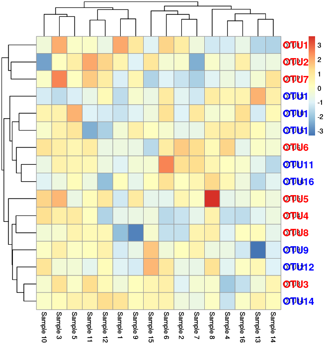
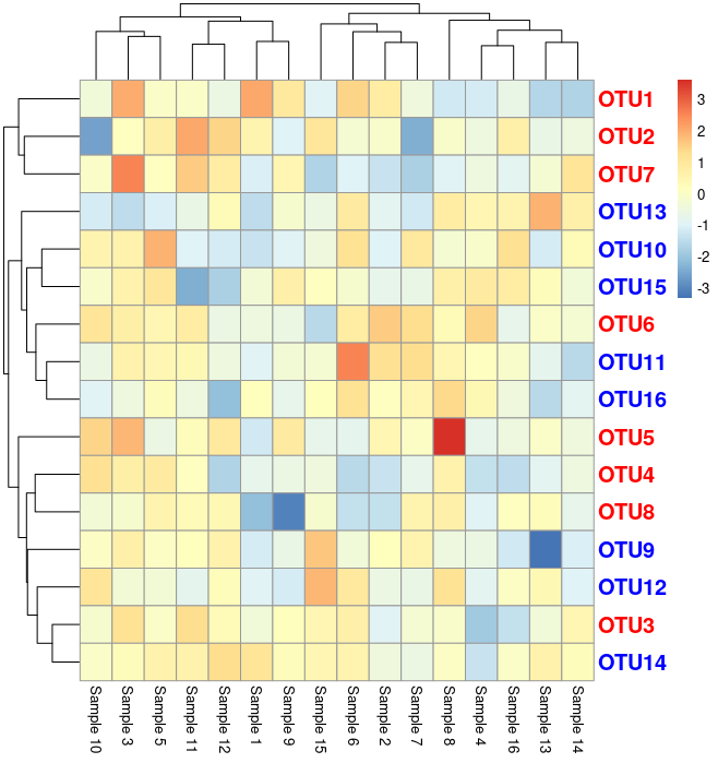
Now as you see, there is a overlap of the row labels (OTU’s in this case). Following is the code for above image. Let us fix it as given below:
#Graphing
p = pheatmap(data[, 1:16], fontsize_row = 15)
dev.off()
#Assuming row labels are in grob 5
cols = data[order(match(rownames(data), p$gtable$grobs[[5]]$label)), ]$colors
p$gtable$grobs[[5]]$gp = gpar(col = cols, fontsize = 15, fontface = "bold")
p
Following is the output: