Post data analysis, a biologist is left with significant genes. These significant genes are associated with fold change, p-value. In addition, they are associated with covariates (categorical variables) such as gender, disease state. There could be several other covariates that are associated with significant genes. In this example let us deal with two such variables: gender (male and female) and condition (normal and tumor).
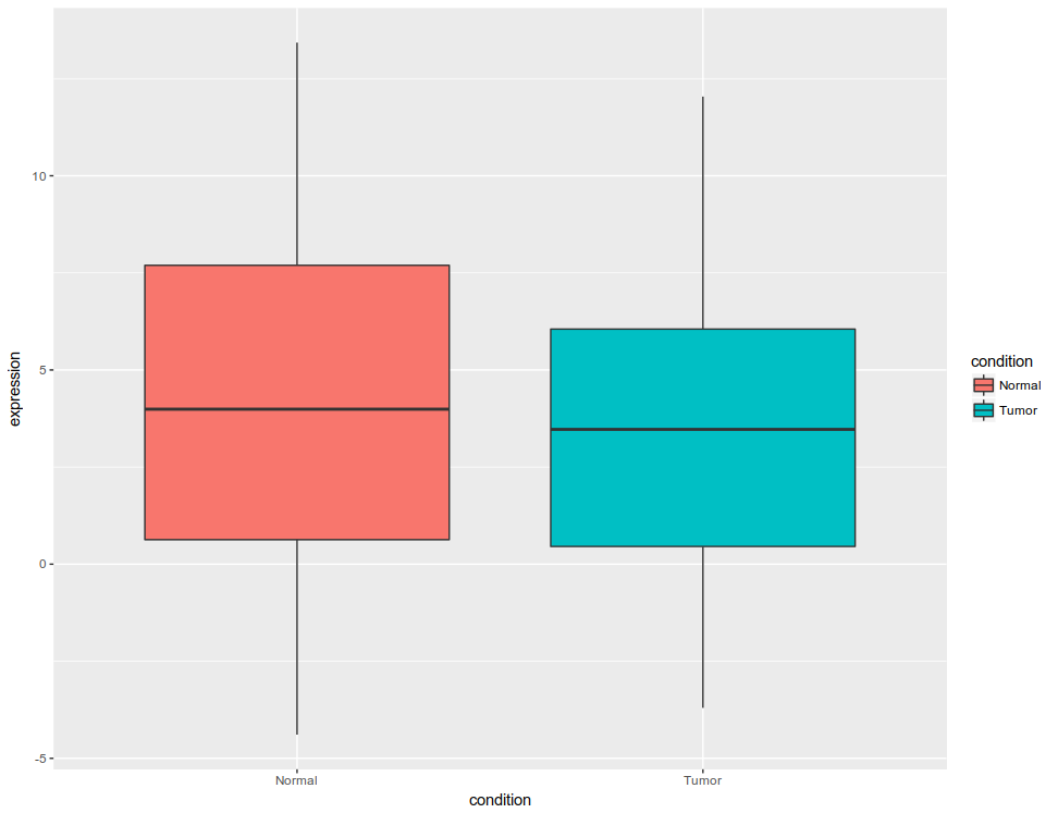
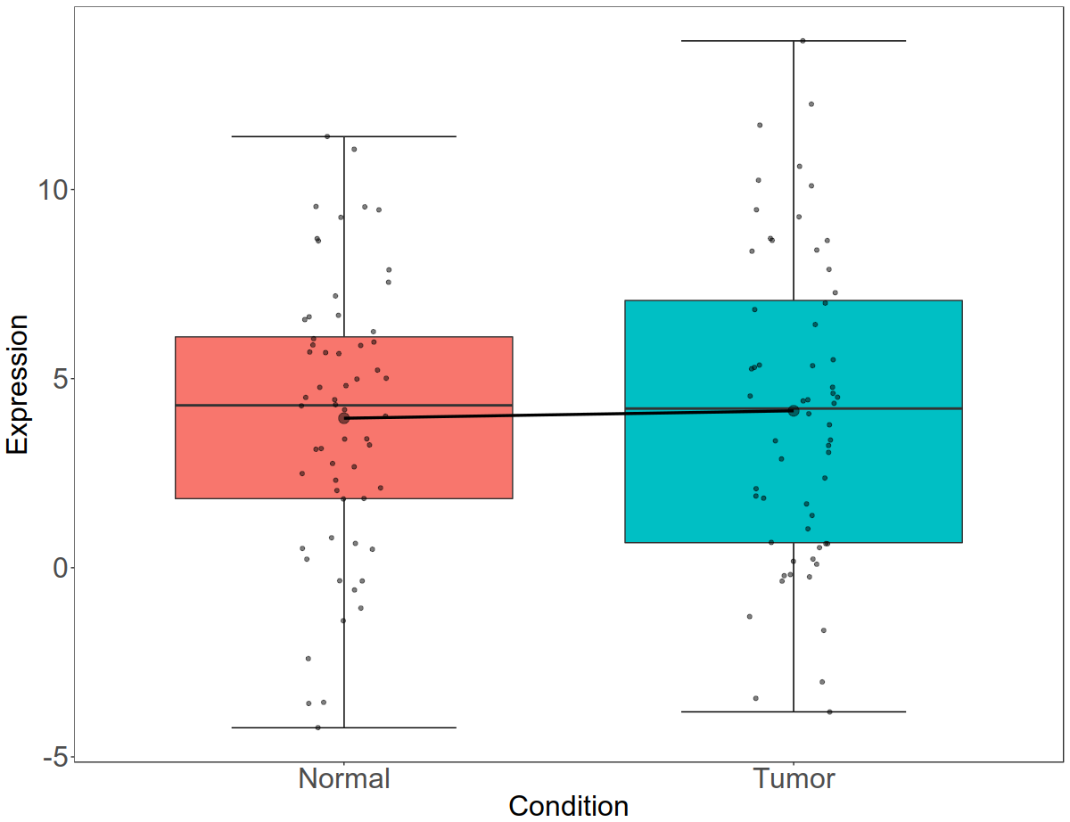
Initial figure would look like this: All the data plotted as box plot, for tumor and normal

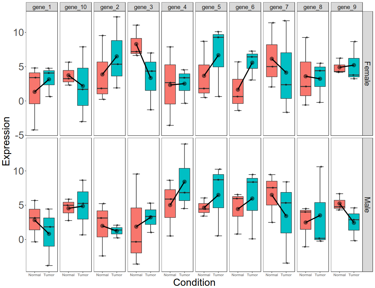
Final picture would look like this with per gene, per gender, per condition box plots:
 Now let us start. Fir simulate expression data for 10 genes with condition (disease state) and gender (male and female) as covariates. The data has expression values 10 genes and 12 samples.
Code to simulate data frame:
==============
$ df1 = data.frame(genes = paste0("gene_", seq(1, 10)), matrix(sample(round(rnorm( 120, 4, 4), 2)), 10, 12))
$ colnames(df1)[-1] = paste0("sample", seq(1, 12))
$ head(df1)
> head(df1)
genes sample1 sample2 sample3 sample4 sample5 sample6 sample7
1 gene_1 -0.35 3.15 5.69 -4.23 3.40 4.81 1.84
2 gene_2 -2.40 5.23 3.13 0.23 1.83 9.54 1.38
3 gene_3 -3.59 -0.34 9.55 7.19 6.63 11.06 5.30
4 gene_4 5.89 0.51 8.64 -3.56 7.88 2.67 13.93
5 gene_5 3.41 4.44 6.06 8.70 0.49 1.82 8.71
6 gene_6 0.79 6.56 5.97 5.70 0.64 -1.40 8.37
sample8 sample9 sample10 sample11 sample12
1 4.44 -3.81 4.07 4.77 0.63
2 2.09 0.23 1.90 5.36 12.26
3 3.36 1.03 4.35 -1.29 7.00
4 6.83 4.51 3.38 -0.35 4.54
5 10.25 0.53 9.28 10.10 0.64
6 9.47 0.09 6.43 3.05 7.27
======================================
Now simulate the categorical variable data (gender and condition). Gender is male and female. Condition is Normal and Tumor. We have 6 samples of Normal and 6 samples of Tumor. With in each condition, 3 are males and 3 are females.
code:
===============================
> pheno = data.frame( samples = paste0("sample", seq(1, 12)), condition = rep(c("Normal", "Tumor"), each = 6), gender = rep(rep(c("Male", "Female"), each = 3), 2))
> pheno
samples condition gender
1 sample1 Normal Male
2 sample2 Normal Male
3 sample3 Normal Male
4 sample4 Normal Female
5 sample5 Normal Female
6 sample6 Normal Female
7 sample7 Tumor Male
8 sample8 Tumor Male
9 sample9 Tumor Male
10 sample10 Tumor Female
11 sample11 Tumor Female
12 sample12 Tumor Female
====================================
ggplot2 deals with long format better than wide format. Hence let us convert the expression data into long format first and then merge with phenotype data (pheno).
code:
==============================
library(tidyr)
df2 = gather(df1, "sample", "expression", -genes)
==================================
Once we have converted the data into long format, let us merge the data and make a single data frame. Make sure that common columns used in merging are of same type.
code:
==============================
pheno$samples=as.character(pheno$samples)
df3 = merge(df2, pheno, by.x = "sample", by.y = "samples")
head(df3)
> head (df3)
sample genes expression condition gender
1 sample1 gene_1 -0.35 Normal Male
2 sample1 gene_2 -2.40 Normal Male
3 sample1 gene_3 -3.59 Normal Male
4 sample1 gene_4 5.89 Normal Male
5 sample1 gene_5 3.41 Normal Male
6 sample1 gene_6 0.79 Normal Male
===============================
Now let us explore the ways of display the data. First let us display the data. Then we will show in different ways of representation. Our final goal is to show the data as box plot. We can show the box plots by the type (either by gender or by condition). Once we display the data by category, then display the data error bars and connect the means by line. First let us draw very basic box plot. Before that let us convert samples as levels.
code:
===========================
library(ggplot2)
df3$sample = as.factor(df3$sample)
ggplot(df3, aes(x = condition, y = expression, fill = condition)) + geom_boxplot(position = position_dodge(width = 1.1))
=============================
 Once we draw the box plots, let us draw the connecting the lines.
code:
=====================
ggplot(df3, aes(x = condition, y = expression, fill = condition)) +
geom_boxplot(position = position_dodge(width = 1.1))+
stat_summary(fun.y=mean, geom="line", aes(group=1)) +
stat_summary(fun.y=mean, geom="point", size=3)
====================================
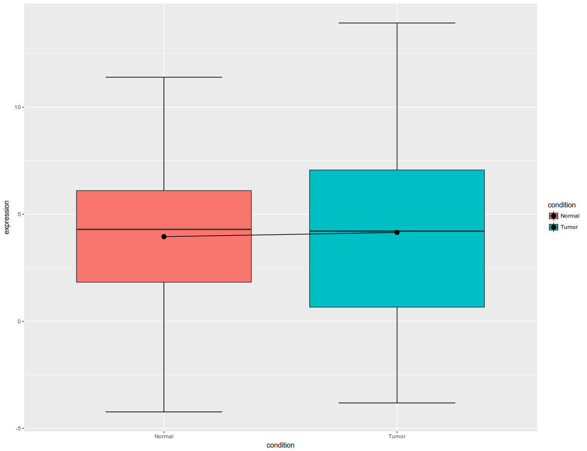
 Boxplots draw median line, in general and in above picture, box plots are connected by mean. Once box plots are drawn, let us add the error bars. Since R is lazy, let us draw error bars first and then other stuff.
code:
==========================
ggplot(df3, aes(x = condition, y = expression, fill = condition)) +
stat_boxplot(geom="errorbar", width=.5)+
geom_boxplot(position = position_dodge(width = 1.1))+
stat_summary(fun.y=mean, geom="line", aes(group=1)) +
stat_summary(fun.y=mean, geom="point", size=3)
====================================
 Now that error bars are drawn, let us overlay the data (using jitter function) on boxplot.
code:
======================================
ggplot(df3, aes(x = condition, y = expression, fill = condition)) +
stat_boxplot(geom="errorbar", width=.5)+
geom_boxplot(position = position_dodge(width = 1.1))+
stat_summary(fun.y=mean, geom="line", aes(group=1),lwd=1.2) +
stat_summary(fun.y=mean, geom="point", size=4, alpha=0.5)+
geom_jitter(width = 0.1, color="black", alpha=0.5)
=======================================
Let us beautify the plot now. We will remove background, increase the font size, remove the legend, increase tick marks and plot titles.
code:
===========================
ggplot(df3, aes(x = condition, y = expression, fill = condition)) +
stat_boxplot(geom="errorbar", width=.5)+
geom_boxplot(position = position_dodge(width = 1.1))+
stat_summary(fun.y=mean, geom="line", aes(group=1),lwd=1.2) +
stat_summary(fun.y=mean, geom="point", size=4, alpha=0.5)+
geom_jitter(width = 0.1, color="black", alpha=0.5) +
labs(x = "Condition", y = "Expression")+
theme_bw()+
theme(
axis.text.x = element_text(size = 24),
axis.text.y = element_text(size = 24),
axis.title.x = element_text(size = 24),
axis.title.y = element_text(size = 24),
panel.grid.major = element_blank(),
panel.grid.minor = element_blank(),
legend.position = "none",
)
========================================
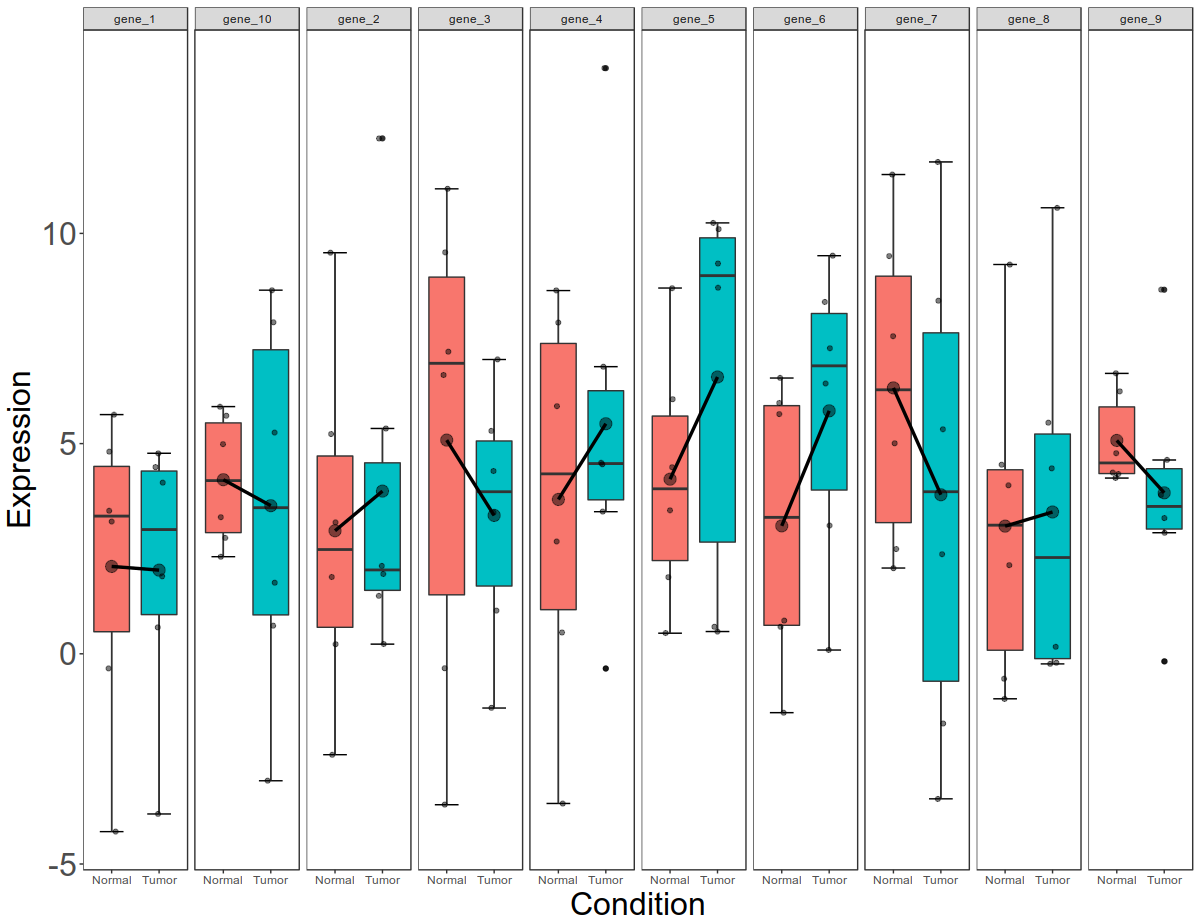
 Now that we have cleaned up the graph little bit, let us draw box plots for all the genes. So far, the box plots represent cumulative data for all genes. Let us break this into per gene box plot.
code:
=======================================
ggplot(df3, aes(x = condition, y = expression, fill = condition)) +
stat_boxplot(geom="errorbar", width=.5)+
geom_boxplot(position = position_dodge(width = 1.1))+
stat_summary(fun.y=mean, geom="line", aes(group=1),lwd=1.2) +
stat_summary(fun.y=mean, geom="point", size=4, alpha=0.5)+
geom_jitter(width = 0.1, color="black", alpha=0.5) +
labs(x = "Condition", y = "Expression")+
theme_bw()+
theme(
axis.text.x = element_text(size = 12),
axis.text.y = element_text(size = 24),
axis.title.x = element_text(size = 24),
axis.title.y = element_text(size = 24),
panel.grid.major = element_blank(),
panel.grid.minor = element_blank(),
legend.position = "none",
)+
facet_grid( ~ genes,
scales = 'free_y',
space = "free"
)
=====================================
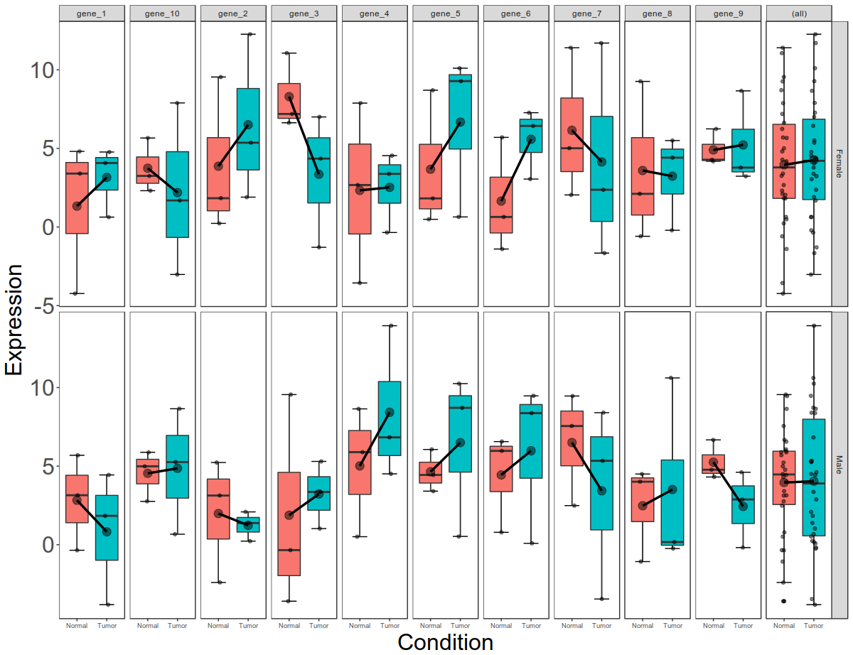
 Now this is per gene, per condition data. Let us now break this down to per gene, per condition, per gender data.
geom_boxplot(position = position_dodge(width = 1.1))+
stat_summary(fun.y=mean, geom="line", aes(group=1),lwd=1.2) +
stat_summary(fun.y=mean, geom="point", size=4, alpha=0.5)+
geom_jitter(width = 0.1, color="black", alpha=0.5) +
labs(x = "Condition", y = "Expression")+
theme_bw()+
theme(
axis.text.x = element_text(size = 9),
axis.text.y = element_text(size = 24),
axis.title.x = element_text(size = 24),
axis.title.y = element_text(size = 24),
panel.grid.major = element_blank(),
panel.grid.minor = element_blank(),
legend.position = "none",
strip.text.x = element_text(size = 14),
strip.text.y = element_text(size = 18),
)+
facet_grid( gender ~ genes,
scales = 'free_y',
space = "free"
)
============================
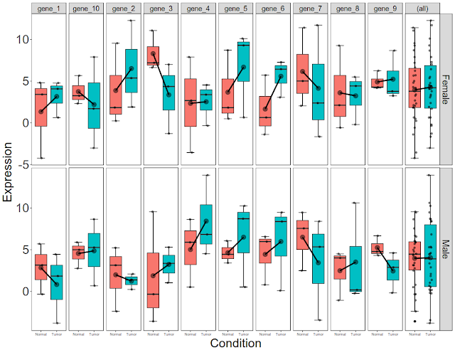
 Now that we have plotted expression data per condition, per gene, per gender, let us plot total gene expression (all 10 gene expression) at the end.
code:
========================================
ggplot(df3, aes(x = condition, y = expression, fill = condition)) +
stat_boxplot(geom="errorbar", width=.5)+
geom_boxplot(position = position_dodge(width = 1.1))+
stat_summary(fun.y=mean, geom="line", aes(group=1),lwd=1.2) +
stat_summary(fun.y=mean, geom="point", size=4, alpha=0.5)+
geom_jitter(width = 0.1, color="black", alpha=0.5) +
labs(x = "Condition", y = "Expression")+
theme_bw()+
theme(
axis.text.x = element_text(size = 7),
axis.text.y = element_text(size = 24),
axis.title.x = element_text(size = 24),
axis.title.y = element_text(size = 24),
panel.grid.major = element_blank(),
panel.grid.minor = element_blank(),
legend.position = "none",
strip.text.x = element_text(size = 14),
strip.text.y = element_text(size = 18)
)+
facet_grid( gender ~ genes,
scales = 'free_y',
space = "free",
margins = "genes"
)
=================================
Initial figure would look like this: All the data plotted as box plot, for tumor and normal

Final picture would look like this with per gene, per gender, per condition box plots:
Code to simulate data frame:
==============
$ df1 = data.frame(genes = paste0("gene_", seq(1, 10)), matrix(sample(round(rnorm( 120, 4, 4), 2)), 10, 12))
$ colnames(df1)[-1] = paste0("sample", seq(1, 12))
$ head(df1)
> head(df1)
genes sample1 sample2 sample3 sample4 sample5 sample6 sample7
1 gene_1 -0.35 3.15 5.69 -4.23 3.40 4.81 1.84
2 gene_2 -2.40 5.23 3.13 0.23 1.83 9.54 1.38
3 gene_3 -3.59 -0.34 9.55 7.19 6.63 11.06 5.30
4 gene_4 5.89 0.51 8.64 -3.56 7.88 2.67 13.93
5 gene_5 3.41 4.44 6.06 8.70 0.49 1.82 8.71
6 gene_6 0.79 6.56 5.97 5.70 0.64 -1.40 8.37
sample8 sample9 sample10 sample11 sample12
1 4.44 -3.81 4.07 4.77 0.63
2 2.09 0.23 1.90 5.36 12.26
3 3.36 1.03 4.35 -1.29 7.00
4 6.83 4.51 3.38 -0.35 4.54
5 10.25 0.53 9.28 10.10 0.64
6 9.47 0.09 6.43 3.05 7.27
======================================
Now simulate the categorical variable data (gender and condition). Gender is male and female. Condition is Normal and Tumor. We have 6 samples of Normal and 6 samples of Tumor. With in each condition, 3 are males and 3 are females.
code:
===============================
> pheno = data.frame( samples = paste0("sample", seq(1, 12)), condition = rep(c("Normal", "Tumor"), each = 6), gender = rep(rep(c("Male", "Female"), each = 3), 2))
> pheno
samples condition gender
1 sample1 Normal Male
2 sample2 Normal Male
3 sample3 Normal Male
4 sample4 Normal Female
5 sample5 Normal Female
6 sample6 Normal Female
7 sample7 Tumor Male
8 sample8 Tumor Male
9 sample9 Tumor Male
10 sample10 Tumor Female
11 sample11 Tumor Female
12 sample12 Tumor Female
====================================
ggplot2 deals with long format better than wide format. Hence let us convert the expression data into long format first and then merge with phenotype data (pheno).
code:
==============================
library(tidyr)
df2 = gather(df1, "sample", "expression", -genes)
==================================
Once we have converted the data into long format, let us merge the data and make a single data frame. Make sure that common columns used in merging are of same type.
code:
==============================
pheno$samples=as.character(pheno$samples)
df3 = merge(df2, pheno, by.x = "sample", by.y = "samples")
head(df3)
> head (df3)
sample genes expression condition gender
1 sample1 gene_1 -0.35 Normal Male
2 sample1 gene_2 -2.40 Normal Male
3 sample1 gene_3 -3.59 Normal Male
4 sample1 gene_4 5.89 Normal Male
5 sample1 gene_5 3.41 Normal Male
6 sample1 gene_6 0.79 Normal Male
===============================
Now let us explore the ways of display the data. First let us display the data. Then we will show in different ways of representation. Our final goal is to show the data as box plot. We can show the box plots by the type (either by gender or by condition). Once we display the data by category, then display the data error bars and connect the means by line. First let us draw very basic box plot. Before that let us convert samples as levels.
code:
===========================
library(ggplot2)
df3$sample = as.factor(df3$sample)
ggplot(df3, aes(x = condition, y = expression, fill = condition)) + geom_boxplot(position = position_dodge(width = 1.1))
=============================
code:
=====================
ggplot(df3, aes(x = condition, y = expression, fill = condition)) +
geom_boxplot(position = position_dodge(width = 1.1))+
stat_summary(fun.y=mean, geom="line", aes(group=1)) +
stat_summary(fun.y=mean, geom="point", size=3)
====================================

code:
==========================
ggplot(df3, aes(x = condition, y = expression, fill = condition)) +
stat_boxplot(geom="errorbar", width=.5)+
geom_boxplot(position = position_dodge(width = 1.1))+
stat_summary(fun.y=mean, geom="line", aes(group=1)) +
stat_summary(fun.y=mean, geom="point", size=3)
====================================
code:
======================================
ggplot(df3, aes(x = condition, y = expression, fill = condition)) +
stat_boxplot(geom="errorbar", width=.5)+
geom_boxplot(position = position_dodge(width = 1.1))+
stat_summary(fun.y=mean, geom="line", aes(group=1),lwd=1.2) +
stat_summary(fun.y=mean, geom="point", size=4, alpha=0.5)+
geom_jitter(width = 0.1, color="black", alpha=0.5)
=======================================

Let us beautify the plot now. We will remove background, increase the font size, remove the legend, increase tick marks and plot titles.
code:
===========================
ggplot(df3, aes(x = condition, y = expression, fill = condition)) +
stat_boxplot(geom="errorbar", width=.5)+
geom_boxplot(position = position_dodge(width = 1.1))+
stat_summary(fun.y=mean, geom="line", aes(group=1),lwd=1.2) +
stat_summary(fun.y=mean, geom="point", size=4, alpha=0.5)+
geom_jitter(width = 0.1, color="black", alpha=0.5) +
labs(x = "Condition", y = "Expression")+
theme_bw()+
theme(
axis.text.x = element_text(size = 24),
axis.text.y = element_text(size = 24),
axis.title.x = element_text(size = 24),
axis.title.y = element_text(size = 24),
panel.grid.major = element_blank(),
panel.grid.minor = element_blank(),
legend.position = "none",
)
========================================
code:
=======================================
ggplot(df3, aes(x = condition, y = expression, fill = condition)) +
stat_boxplot(geom="errorbar", width=.5)+
geom_boxplot(position = position_dodge(width = 1.1))+
stat_summary(fun.y=mean, geom="line", aes(group=1),lwd=1.2) +
stat_summary(fun.y=mean, geom="point", size=4, alpha=0.5)+
geom_jitter(width = 0.1, color="black", alpha=0.5) +
labs(x = "Condition", y = "Expression")+
theme_bw()+
theme(
axis.text.x = element_text(size = 12),
axis.text.y = element_text(size = 24),
axis.title.x = element_text(size = 24),
axis.title.y = element_text(size = 24),
panel.grid.major = element_blank(),
panel.grid.minor = element_blank(),
legend.position = "none",
)+
facet_grid( ~ genes,
scales = 'free_y',
space = "free"
)
=====================================
 Now this is per gene, per condition data. Let us now break this down to per gene, per condition, per gender data.
code:
=================
ggplot(df3, aes(x = condition, y = expression, fill = condition)) +
stat_boxplot(geom="errorbar", width=.5)+geom_boxplot(position = position_dodge(width = 1.1))+
stat_summary(fun.y=mean, geom="line", aes(group=1),lwd=1.2) +
stat_summary(fun.y=mean, geom="point", size=4, alpha=0.5)+
geom_jitter(width = 0.1, color="black", alpha=0.5) +
labs(x = "Condition", y = "Expression")+
theme_bw()+
theme(
axis.text.x = element_text(size = 9),
axis.text.y = element_text(size = 24),
axis.title.x = element_text(size = 24),
axis.title.y = element_text(size = 24),
panel.grid.major = element_blank(),
panel.grid.minor = element_blank(),
legend.position = "none",
strip.text.x = element_text(size = 14),
strip.text.y = element_text(size = 18),
)+
facet_grid( gender ~ genes,
scales = 'free_y',
space = "free"
)
============================
code:
========================================
ggplot(df3, aes(x = condition, y = expression, fill = condition)) +
stat_boxplot(geom="errorbar", width=.5)+
geom_boxplot(position = position_dodge(width = 1.1))+
stat_summary(fun.y=mean, geom="line", aes(group=1),lwd=1.2) +
stat_summary(fun.y=mean, geom="point", size=4, alpha=0.5)+
geom_jitter(width = 0.1, color="black", alpha=0.5) +
labs(x = "Condition", y = "Expression")+
theme_bw()+
theme(
axis.text.x = element_text(size = 7),
axis.text.y = element_text(size = 24),
axis.title.x = element_text(size = 24),
axis.title.y = element_text(size = 24),
panel.grid.major = element_blank(),
panel.grid.minor = element_blank(),
legend.position = "none",
strip.text.x = element_text(size = 14),
strip.text.y = element_text(size = 18)
)+
facet_grid( gender ~ genes,
scales = 'free_y',
space = "free",
margins = "genes"
)
=================================
