Post data analysis, scientists end up with list of genes (or biological molecules) and their expression values per sample at each time point. Now the requirement is to plot the data. Let us look a scenario where biologist wants to have a overall view of expression for all the genes, for all the time points and for all the samples. Biologist may also want to highlight the average (mean) expression value per sample or for a gene. Let us assume that there are 10 genes, 12 samples, 4 time points. User wants create an image where all above data is represented along with their mean.
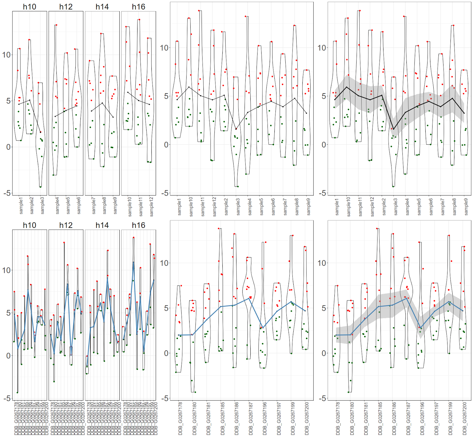
Final figure would look like this:

Final figure would look like this:

Let us simulate the data
Data will have expression values for 10 genes for 12 samples at 4 times points. We will do plot following information using ggplot2 package. We will plot gene specific expression for each time point highlighting expression and mean (and standard error of mean). In addition, we will highlight expression values above and below mean.
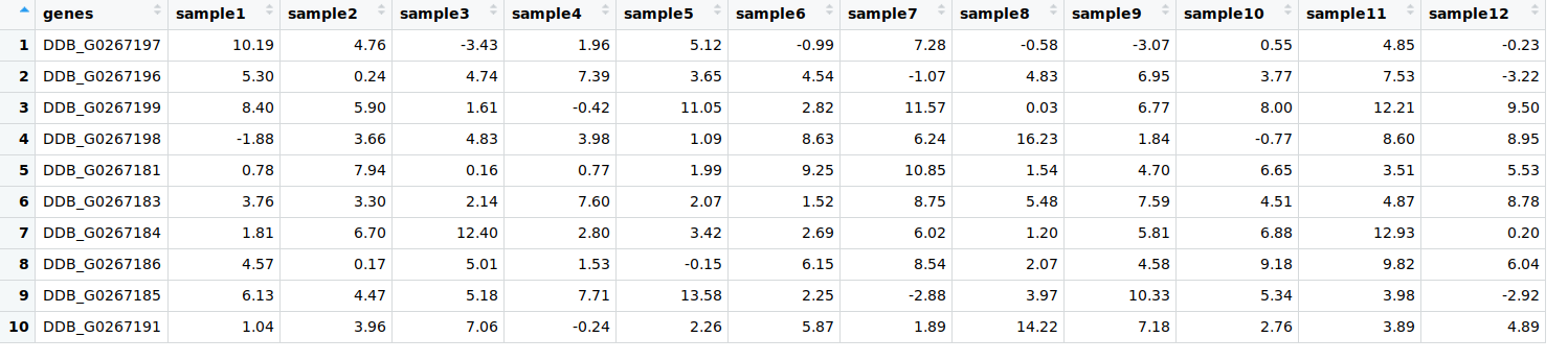
$ df1=data.frame(genes = paste0("DDB_G0267",sample(c(178:200), 10, replace = F)),matrix(sample(round(rnorm( 120, 4, 4), 2)), 10, 12))
$ colnames(df1)[-1] = paste0("sample", seq(1, 12))
Let us have a look at df1:
Let us simulate the meta data with time points, h10, h12, h14 and h16. 3 samples for each time point
$ pheno= data.frame(samples = paste0("sample", seq(1, 12)),time = rep(c("h10","h12","h14","h16"), each = 3))
Let us calculate the means of samples (columns) and genes (rows), separately.
Sample means can be appended sample meta data as sample numbers are same for both.
$ samples=data.frame(samples=colnames(df1[-1]), sample_means=colMeans(df1[-1]), stringsAsFactors = F, time=pheno$time)geno=data.frame(genes=df1[1],gene_means=rowMeans(df1[-1]), stringsAsFactors = F)
Let us convert the long format to wide format
$ library(tidyr)$ df2=gather(df1,"samples","expression",-"genes")
Let us merge the data with meta data. We create gene expression means for samples and times separately to merge with main data.
$ library(dplyr)$ df3=merge(df2,samples, by="samples")
$ df4=merge(df3,geno, by="genes")
$ df5=df4 %>% group_by(genes,time) %>% mutate(gene_time_mean=mean(expression))
Let us plot the data, metadata now. First sample sample specific data, then gene specific data.
What we will do is store the plot objects and then draw them together with gridextra.Let us plot for samples first.
There are 3 graph objects for samples. First one would be cumulative (for all 10 genes) expression values per sample per time point with mean only, Second one would be cumulative gene expression values per sample with mean only and last one would be cumulative gene expression values per sample with mean and standard error only.$ library(ggplot2)
$ s1=ggplot(df3, aes(samples, expression))+ geom_violin()+
geom_jitter(aes(color=expression>sample_means), width = 0.2)+
scale_colour_manual(values=c("darkgreen", "red"))+
stat_summary(fun.y=mean, geom="point", aes(group=1), size=1)+
stat_summary(color="black", geom = "line", aes(group=1))+
facet_grid(~time, scales = "free")+
theme_bw()+
theme(
legend.position = "none",
strip.text.x = element_text(size = 24),
strip.background = element_blank(),
axis.text.x = element_text(size = 14, angle=90),
axis.text.y = element_text(size = 24),
axis.title.x = element_blank(),
axis.title.y = element_blank()
)
s2=ggplot(df3, aes(samples, expression))+
geom_violin()+
geom_jitter(aes(color=expression>sample_means), width = 0.2)+
scale_colour_manual(values=c("darkgreen", "red"))+
stat_summary(fun.y=mean, geom="point", aes(group=1), size=1)+
stat_summary(color="black", geom = "line", aes(group=1))+
theme_bw()+
theme(
legend.position = "none",
axis.text.x = element_text(size = 14, angle=90),
axis.text.y = element_text(size = 24),
axis.title.x = element_blank(),
axis.title.y = element_blank()
)
s3=ggplot(df3, aes(samples, expression))+ geom_violin()+
geom_jitter(aes(color=expression>sample_means), width = 0.2)+
scale_colour_manual(values=c("darkgreen", "red"))+
stat_summary(fun.y=mean, geom="point", aes(group=1), size=1)+
stat_summary(color="black", geom = "smooth", aes(group=1))+
theme_bw()+
theme(
legend.position = "none",
axis.text.x = element_text(size = 14, angle=90),
axis.text.y = element_text(size = 24),
axis.title.x = element_blank(),
axis.title.y = element_blank()
)
axis.text.y = element_text(size = 24),
axis.title.x = element_blank(),
axis.title.y = element_blank()
)
s3=ggplot(df3, aes(samples, expression))+ geom_violin()+
geom_jitter(aes(color=expression>sample_means), width = 0.2)+
scale_colour_manual(values=c("darkgreen", "red"))+
stat_summary(fun.y=mean, geom="point", aes(group=1), size=1)+
stat_summary(color="black", geom = "smooth", aes(group=1))+
theme_bw()+
theme(
legend.position = "none",
axis.text.x = element_text(size = 14, angle=90),
axis.text.y = element_text(size = 24),
axis.title.x = element_blank(),
axis.title.y = element_blank()
)
Let us plot for genes next.
There are 3 graph objects for genes. First one would be cumulative (for all 12 samples) expression values per gene per time point with mean only, Second one would be cumulative sample expression values per gene with mean only and last one would be cumulative sample expression values per gene with mean and standard error only.
$ g1=ggplot(df5, aes(genes, expression))+
geom_violin()+
geom_jitter(width = 0.2, aes(color=expression>gene_time_mean))+
scale_colour_manual(values=c("darkgreen", "red"))+
stat_summary(fun.y=mean, geom="point", aes(group=1), size=1)+
stat_summary(color="steelblue", geom = "line", aes(group=1), size=1.2)+
theme_bw()+
theme(
legend.position = "none",
strip.text.x = element_text(size = 14),
strip.background = element_blank(),
axis.text.x = element_text(size = 14, angle=90),
axis.text.y = element_text(size = 14),
axis.title.x = element_blank(),
axis.title.y = element_blank()
)+
facet_grid(~time)
g2=ggplot(df5, aes(genes, expression))+ geom_violin()+
geom_jitter(width = 0.2, aes(color=expression>gene_means))+
scale_colour_manual(values=c("darkgreen", "red"))+
stat_summary(fun.y=mean, geom="point", aes(group=1), size=1)+
stat_summary(color="steelblue", geom = "line", aes(group=1), size=1.2)+
theme_bw()+
theme(
legend.position = "none",
axis.text.x = element_text(size = 14, angle=90),
axis.text.y = element_text(size = 14),
axis.title.x = element_blank(),
axis.title.y = element_blank()
)
g3=ggplot(df5, aes(genes, expression))+ geom_violin()+
geom_jitter(width = 0.2, aes(color=expression>gene_means))+
scale_colour_manual(values=c("darkgreen", "red"))+
stat_summary(fun.y=mean, geom="point", aes(group=1), size=1)+
stat_summary(color="steelblue", geom = "smooth", aes(group=1), size=1.2)+
theme_bw()+
theme(
legend.position = "none",
axis.text.x = element_text(size = 14, angle=90),
axis.text.y = element_text(size = 14),
axis.title.x = element_blank(),
axis.title.y = element_blank()
)
Let us plot altogether
$ library(gridExtra)$ grid.arrange(s1,s2,s3,g1,g2,g3, nrow = 2, ncol=3)