In R, there are several efficient ways to plot multiple Y and/or multiple X plots. In today's note, simplest way (may be crude) to plot multiple Y axes (two) with legend are shown with example. Logic is :
1) Plot one graph
2) Initiate new graph
3) Plot second graph, but do not draw x and y axis i.e visually only points are displayed, but not their axes. X axis is already drwn step 1 and Y axis needs to be drawn on the other side (i.e right side of the plot)
4) Draw the Y-axis on right hand side for the second plot
5) Add legend to the right top corner of the plot.
Let us jump into example code:
1) R has a preloaded data called "mtcars". Let us load it first. Please note that R by default installs several example datasets with package by name, "datasets". Launch R and type in code provided below:
code: data(mtcars)
2) Check the data headers
code: head(mtcars)
It should look like this:
 3) Let us save the plot as png before starting plotting: code: png("graph.png", height=960, width = 960, units = "px", pointsize = 20)
4) Initiate plotting by defining graph margins.
code: par(mar=c(4, 4, 4, 4) + 0.1)
5) Let us plot car weights (in kilo pounds) against car mileage by running following command:
code: plot(mtcars$wt ~ mtcars$mpg, pch=19, col="green", ylim=c(min(mtcars$wt), max(mtcars$wt)), xlim=c(min(mtcars$mpg), max(mtcars$mpg)+5),xlab="Mileage(Miles per gallon)", ylab="Car Weight in kilo pounds")
Plot looks like this (in the back ground) though you won't see on screen:

Logic:
pch=19, col="green" (draw filled circles, colored green
y axis limits (ylim) = from min value (min(mtcars$wt)) to max value (max(mtcars$wt)) of variable "car weight"
x axis limits (xlim) = from min value to max value of variable "car mileage"
x lab and y lab are labels for x and y axes.
6) Initiate new graph over the existing graph
code: par(new=TRUE)
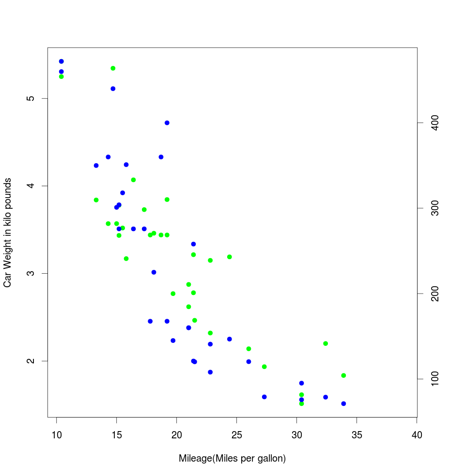
7) Draw the second graph.This graph plots piston capacity and car weights.
code: plot(mtcars$disp ~ mtcars$mpg, pch=19, col="blue", xlim=c(min(mtcars$mpg), max(mtcars$mpg)+5), axes=F, xlab="", ylab="")
Please note that axes=F means do not display X and Y axis in graph (i.e dispaly only values). X and Y axis labels are supprssed for display.
Plot looks like this (in the back ground) though you won't see on screen:
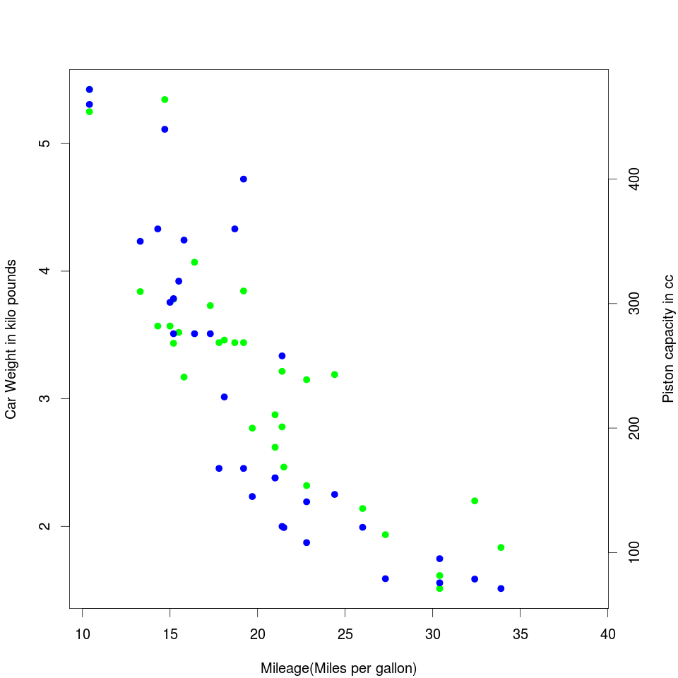
 8) Display axis on right side of the graph.
code: axis(4)
Please note that for axis function, following are the values to display the axis: 4= right side, 3= Top side, 2= left side, 1= bottom side.
Plot looks like this (in the back ground) though you won't see on screen:

9) Add text to the second y-axis
code: mtext("Piston capacity in cc", line=3, side=4)
Plot looks like this (in the back ground) though you won't see on screen:
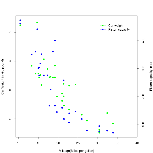
10) Add legend to the graph on right top corner.
code: legend("topright", c("Car weight", "Piston capacity"), box.lty = 0, lty=1, pch=19, col=c("green", "blue"), inset=0.05)
Plot looks like this (in the back ground) though you won't see on screen:
11) Eng the image plotting
code: dev.off()
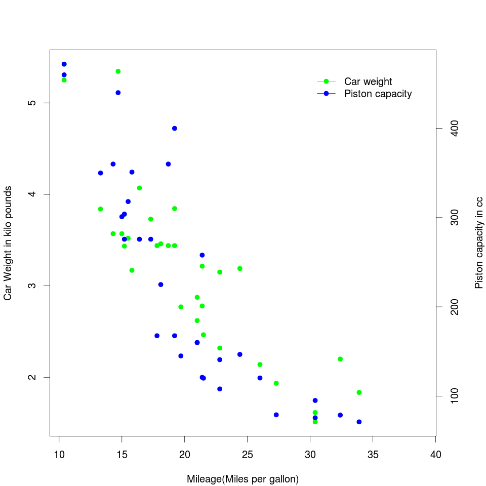
12) Final image should look like this (just as above):
Entire code:
data(mtcars)
head(mtcars)
png("graph4.png", height=960, width = 960, units = "px", pointsize = 20,)
par(mar=c(4, 4, 4, 4) + 0.1)
plot(mtcars$wt ~ mtcars$mpg, pch=19, col="green", ylim=c(min(mtcars$wt), max(mtcars$wt)), xlim=c(min(mtcars$mpg), max(mtcars$mpg)+5),xlab="Mileage(Miles per gallon)", ylab="Car Weight in kilo pounds")
par(new=TRUE)
plot(mtcars$disp ~ mtcars$mpg, pch=19, col="blue", xlim=c(min(mtcars$mpg), max(mtcars$mpg)+5), axes=F, xlab="", ylab="")
axis(4)
mtext("Piston capacity in cc", line=3, side=4)
legend("topright", c("Car weight", "Piston capacity"), box.lty = 0, lty=1, pch=19, col=c("green", "blue"), inset=0.05)
dev.off()
1) Plot one graph
2) Initiate new graph
3) Plot second graph, but do not draw x and y axis i.e visually only points are displayed, but not their axes. X axis is already drwn step 1 and Y axis needs to be drawn on the other side (i.e right side of the plot)
4) Draw the Y-axis on right hand side for the second plot
5) Add legend to the right top corner of the plot.
Let us jump into example code:
1) R has a preloaded data called "mtcars". Let us load it first. Please note that R by default installs several example datasets with package by name, "datasets". Launch R and type in code provided below:
code: data(mtcars)
2) Check the data headers
code: head(mtcars)
It should look like this:

4) Initiate plotting by defining graph margins.
code: par(mar=c(4, 4, 4, 4) + 0.1)
Please note that function "par" allows user to set the graph margins with arguement "mar" (as lines of text). Default parameters for the graph plotting with plot function is c(5, 4, 4, 2) + 0.1. This means that on Y axis, we have only 2 lines of margin. Let us make it 4, though 3 is enough for us.
5) Let us plot car weights (in kilo pounds) against car mileage by running following command:
code: plot(mtcars$wt ~ mtcars$mpg, pch=19, col="green", ylim=c(min(mtcars$wt), max(mtcars$wt)), xlim=c(min(mtcars$mpg), max(mtcars$mpg)+5),xlab="Mileage(Miles per gallon)", ylab="Car Weight in kilo pounds")
Plot looks like this (in the back ground) though you won't see on screen:
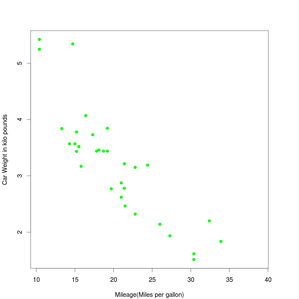
Logic:
pch=19, col="green" (draw filled circles, colored green
y axis limits (ylim) = from min value (min(mtcars$wt)) to max value (max(mtcars$wt)) of variable "car weight"
x axis limits (xlim) = from min value to max value of variable "car mileage"
x lab and y lab are labels for x and y axes.
6) Initiate new graph over the existing graph
code: par(new=TRUE)
7) Draw the second graph.This graph plots piston capacity and car weights.
code: plot(mtcars$disp ~ mtcars$mpg, pch=19, col="blue", xlim=c(min(mtcars$mpg), max(mtcars$mpg)+5), axes=F, xlab="", ylab="")
Please note that axes=F means do not display X and Y axis in graph (i.e dispaly only values). X and Y axis labels are supprssed for display.
Plot looks like this (in the back ground) though you won't see on screen:

code: axis(4)
Please note that for axis function, following are the values to display the axis: 4= right side, 3= Top side, 2= left side, 1= bottom side.
Plot looks like this (in the back ground) though you won't see on screen:
9) Add text to the second y-axis
code: mtext("Piston capacity in cc", line=3, side=4)
Plot looks like this (in the back ground) though you won't see on screen:
10) Add legend to the graph on right top corner.
code: legend("topright", c("Car weight", "Piston capacity"), box.lty = 0, lty=1, pch=19, col=c("green", "blue"), inset=0.05)
Plot looks like this (in the back ground) though you won't see on screen:
11) Eng the image plotting
code: dev.off()
12) Final image should look like this (just as above):
data(mtcars)
head(mtcars)
png("graph4.png", height=960, width = 960, units = "px", pointsize = 20,)
par(mar=c(4, 4, 4, 4) + 0.1)
plot(mtcars$wt ~ mtcars$mpg, pch=19, col="green", ylim=c(min(mtcars$wt), max(mtcars$wt)), xlim=c(min(mtcars$mpg), max(mtcars$mpg)+5),xlab="Mileage(Miles per gallon)", ylab="Car Weight in kilo pounds")
par(new=TRUE)
plot(mtcars$disp ~ mtcars$mpg, pch=19, col="blue", xlim=c(min(mtcars$mpg), max(mtcars$mpg)+5), axes=F, xlab="", ylab="")
axis(4)
mtext("Piston capacity in cc", line=3, side=4)
legend("topright", c("Car weight", "Piston capacity"), box.lty = 0, lty=1, pch=19, col=c("green", "blue"), inset=0.05)
dev.off()