Ballgown is a R library written for RNAseq data analysis as part of New tuxedo work flow. It is available here . For this you should have followed the note here on RNAseq analysis. Ballgown library in R allows the user to download the output from StringTie and allows the user to do statistical analysis.
Directory structure is as shown below:

Out put from StringTie is present in 6 directories under stringtie folder. Let us load the output from stringtie into CRAN-R. Install ballgown package in R before proceeding.
Launch either R or R-studio:
# Load ballgown library
$ library(ballgown)
# Import StringTie output into R
$ bg=ballgown(dataDir="~/example_data/practice_rnaseq_data/stringtie/", samplePattern = "hcc", meas='all')
# Print sample names
$ sampleNames(bg)
# Create a dataframe with sample names and their group (normal and tumor) and append this data as phenotypic data of samples
pData(bg)=data.frame(id=sampleNames(bg), group=rep(c("normal","tumor"), each=3))
# Look at the metadata of samples
> pData(bg)
id group
1 hcc1395_normal_rep1 normal
2 hcc1395_normal_rep2 normal
3 hcc1395_normal_rep3 normal
4 hcc1395_tumor_rep1 tumor
5 hcc1395_tumor_rep2 tumor
6 hcc1395_tumor_rep3 tumor
# Extract Transcript level expression measurements. We can extract all the information
# (FPKM and Coverage) or individual (FPKM or Coverage). Let us extract all information.
$ tx_table = texpr(bg, "all")
# Extract Transcript level expression measurements. To extract FPKM, use following
# command.
$ fpkm = texpr(bg,meas="FPKM")
# Let us calculate the differentially expressed transcripts using group information (normal vs tumor) and FPKM information.
$ det = stattest(bg, feature="transcript", covariate="group", getFC=TRUE, meas="FPKM")
Note: Stattest is inbuilt function of ballgown library.
# If you want to calculate differentially expressed genes instead of transcripts, use
$ deg = stattest(bg, feature="gene", covariate="group", getFC=TRUE, meas="FPKM")
Note that above commands are without filtering data.
Now you can use this data for filtering top genes either by adjusted p-value (q-val) or fold change.
A working script for ballgown is below. This workflow assumes that output from stringtie is stored as per ballgown requirements i.e each sample has it's own directory and stringtie output is stored per sample in individual directories.
======================================
# for ballgown analysis
library(ballgown)
# for plot labeling
library(calibrate)
# for manipulating file names/strings
library(stringr)
# make the ballgown object:
bg = ballgown (dataDir="<stringtie_output_directories>", samplePattern="hcc", meas='all')
## where did you merge from
bg@dirs
## when did you merge?
bg@mergedDate
## what did you import?
bg@meas
##Extract expression (expr) values (as FPKM) for transcripts (t)
transcript_fpkm = texpr(bg, 'FPKM')
##Extract expression (expr) values (as coverage) for transcripts (t)
transcript_cov = texpr(bg, 'cov')
##Extract expression (expr) values (as FPKM, Coverage) for transcripts (t)
whole_tx_table = texpr(bg, 'all')
##Extract expression (expr) values (as FPKM, Coverage) for junctions and introns (t)
whole_intron_table = iexpr(bg, 'all')
##Extract expression (expr) values (as FPKM) for exons (e)
exon_mcov = eexpr(bg, 'mcov')
##Extract expression (expr) values (as FPKM) for junction reads (i)
junction_rcount = iexpr(bg)
Directory structure is as shown below:
Out put from StringTie is present in 6 directories under stringtie folder. Let us load the output from stringtie into CRAN-R. Install ballgown package in R before proceeding.
Launch either R or R-studio:
# Load ballgown library
$ library(ballgown)
# Import StringTie output into R
$ bg=ballgown(dataDir="~/example_data/practice_rnaseq_data/stringtie/", samplePattern = "hcc", meas='all')
# Print sample names
$ sampleNames(bg)
# Create a dataframe with sample names and their group (normal and tumor) and append this data as phenotypic data of samples
pData(bg)=data.frame(id=sampleNames(bg), group=rep(c("normal","tumor"), each=3))
# Look at the metadata of samples
> pData(bg)
id group
1 hcc1395_normal_rep1 normal
2 hcc1395_normal_rep2 normal
3 hcc1395_normal_rep3 normal
4 hcc1395_tumor_rep1 tumor
5 hcc1395_tumor_rep2 tumor
6 hcc1395_tumor_rep3 tumor
# Extract Transcript level expression measurements. We can extract all the information
# (FPKM and Coverage) or individual (FPKM or Coverage). Let us extract all information.
$ tx_table = texpr(bg, "all")
# Extract Transcript level expression measurements. To extract FPKM, use following
# command.
$ fpkm = texpr(bg,meas="FPKM")
# Let us calculate the differentially expressed transcripts using group information (normal vs tumor) and FPKM information.
$ det = stattest(bg, feature="transcript", covariate="group", getFC=TRUE, meas="FPKM")
Note: Stattest is inbuilt function of ballgown library.
# If you want to calculate differentially expressed genes instead of transcripts, use
$ deg = stattest(bg, feature="gene", covariate="group", getFC=TRUE, meas="FPKM")
Note that above commands are without filtering data.
Now you can use this data for filtering top genes either by adjusted p-value (q-val) or fold change.
A working script for ballgown is below. This workflow assumes that output from stringtie is stored as per ballgown requirements i.e each sample has it's own directory and stringtie output is stored per sample in individual directories.
======================================
# for ballgown analysis
library(ballgown)
# for plot labeling
library(calibrate)
# for manipulating file names/strings
library(stringr)
# make the ballgown object:
bg = ballgown (dataDir="<stringtie_output_directories>", samplePattern="hcc", meas='all')
## where did you merge from
bg@dirs
## when did you merge?
bg@mergedDate
## what did you import?
bg@meas
##Extract expression (expr) values (as FPKM) for transcripts (t)
transcript_fpkm = texpr(bg, 'FPKM')
##Extract expression (expr) values (as coverage) for transcripts (t)
transcript_cov = texpr(bg, 'cov')
##Extract expression (expr) values (as FPKM, Coverage) for transcripts (t)
whole_tx_table = texpr(bg, 'all')
##Extract expression (expr) values (as FPKM, Coverage) for junctions and introns (t)
whole_intron_table = iexpr(bg, 'all')
##Extract expression (expr) values (as FPKM) for exons (e)
exon_mcov = eexpr(bg, 'mcov')
##Extract expression (expr) values (as FPKM) for junction reads (i)
junction_rcount = iexpr(bg)
##Extract expression (expr) values (as FPKM) for genes (g).
gene_expression = gexpr(bg)
##Look at the exon, intron and transcript data
structure(bg)$exon
structure(bg)$intron
structure(bg)$trans
## Store mapping between exon and transcripts
exon_transcript_table = indexes(bg)$e2t
## Store mapping between transcripts and genes
transcript_gene_table = indexes(bg)$t2g
# how many exons are there?length(rownames(exon_transcript_table))
# how many transcripts are there?
length(rownames(transcript_gene_table))
# how many genes are there?
length(unique(transcript_gene_table[,"g_id"])) #Unique Gene count
### transcript stats
## plot average transcript length
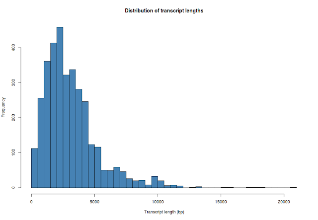
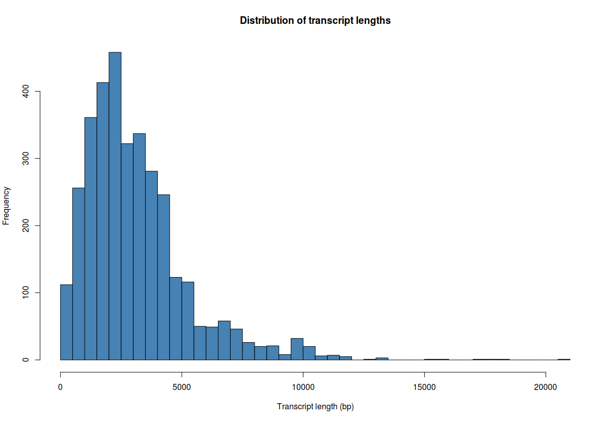
hist(whole_tx_table$length, breaks=50, xlab="Transcript length (bp)", main="Distribution of transcript lengths", col="steelblue")
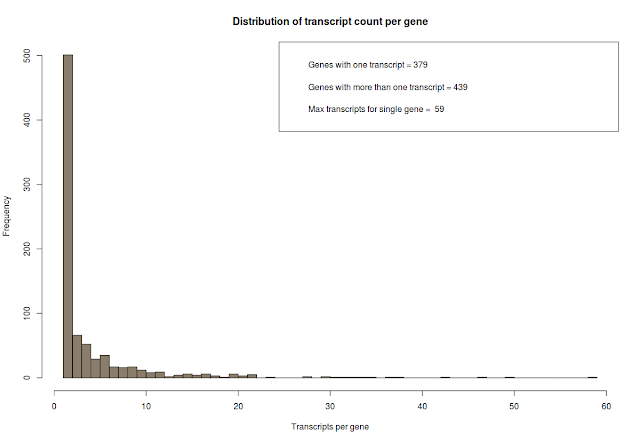
# how many transcripts are there per gene? count the number of genes and count the number of transcripts pere gene and plot it.
counts=table(transcript_gene_table[,"g_id"])
## some interesting stats
# genes with one transcript
c_one = length(which(counts == 1))
# genes with more than one transcript
c_more_than_one = length(which(counts > 1))
# what is the maximum number of transcript per gene
c_max = max(counts)
# plot above data
hist(counts, breaks=50, col="bisque4", xlab="Transcripts per gene", main="Distribution of transcript count per gene")
# add legend
legend_text = c(paste("Genes with one transcript =", c_one), paste("Genes with more than one transcript =", c_more_than_one), paste("Max transcripts for single gene = ", c_max))
legend("topright", legend_text)
## extract gene names and transcript names
gene_names=data.frame(SYMBOL=unique(rownames(gene_expression)))
## create sample meta data frame
phenotype_table= data.frame(id=sampleNames(bg), group=rep(c("normal","tumor"), each=3))
pData(bg) =phenotype_table
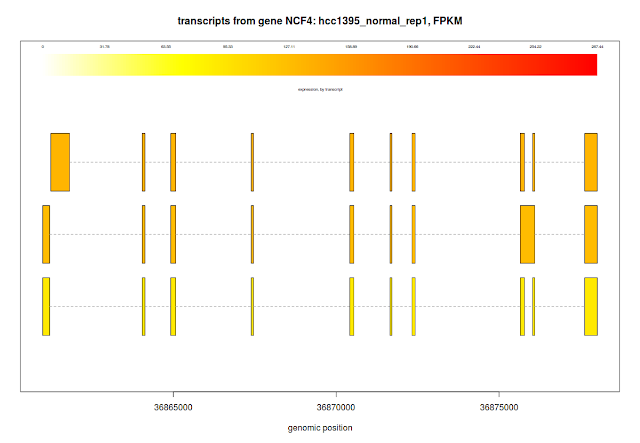
## plotTranscripts for a gene, for a sample
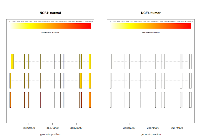
plotTranscripts(gene='NCF4', bg, samples='hcc1395_normal_rep1', meas='FPKM', colorby='transcript', main='transcripts from gene NCF4: hcc1395_normal_rep1, FPKM')
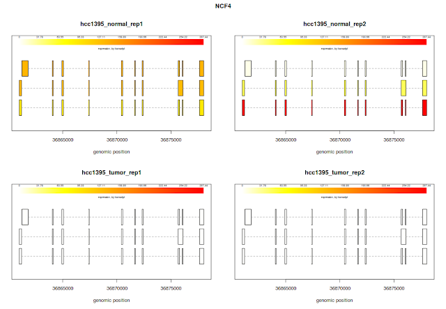
## plotTranscripts for a gene, for 3 samples
plotTranscripts('NCF4', bg, samples=c('hcc1395_normal_rep1', 'hcc1395_normal_rep2', 'hcc1395_tumor_rep1', 'hcc1395_tumor_rep2'), meas='FPKM', colorby='transcript')
## plot transcript means for all the samples,
plotMeans('NCF4', bg, groupvar='group', meas='FPKM', colorby='transcript')
## differential transcript expression
results_txns = stattest(bg, feature='transcript', getFC = T, covariate='group',meas='FPKM' )
# Extract transcript names
t.ids=whole_tx_table[,c(1,6)]
# Unique transcript names and ids
t_names=unique(whole_tx_table[,c(1,6)])
# merge transcript results with transcript names
results_txns_merged = merge(results_txns,t.ids,by.x=c("id"),by.y=c("t_id"))
head(results_txns_merged)
# Calculate differentially expressed genes and use FPKM in calculating # # # # differential gene expression
results_genes = stattest(bg, feature="gene", covariate="group", getFC=TRUE, meas="FPKM")
## Compare the data before and after normalization. boxplot with and without log transformation
par(mfrow=c(1,2))
boxplot(gene_expression, col=rainbow(6), las=2, ylab="log2(FPKM)", main="Distribution of FPKMs for all 6 samples")
boxplot(log2(gene_expression+1), col=rainbow(6), las=2, ylab="log2(FPKM)", main="log transformed distribution of FPKMs for all 6 samples")
# dev.off()

## FPKM values are not logged. Hence fold change (FC) is not also logged. Log # fold changes and store it in logfc columnresults_genes[,"logfc"] = log2(results_genes[,"fc"])
# Identify the genes (rows) with adjusted p-value (i.eq-value) < 0.05
qsig=which(results_genes$qval<0.05)
gene_expression = gexpr(bg)
##Look at the exon, intron and transcript data
structure(bg)$exon
structure(bg)$intron
structure(bg)$trans
## Store mapping between exon and transcripts
exon_transcript_table = indexes(bg)$e2t
## Store mapping between transcripts and genes
transcript_gene_table = indexes(bg)$t2g
# how many exons are there?length(rownames(exon_transcript_table))
# how many transcripts are there?
length(rownames(transcript_gene_table))
# how many genes are there?
length(unique(transcript_gene_table[,"g_id"])) #Unique Gene count
### transcript stats
## plot average transcript length
hist(whole_tx_table$length, breaks=50, xlab="Transcript length (bp)", main="Distribution of transcript lengths", col="steelblue")
counts=table(transcript_gene_table[,"g_id"])
## some interesting stats
# genes with one transcript
c_one = length(which(counts == 1))
# genes with more than one transcript
c_more_than_one = length(which(counts > 1))
# what is the maximum number of transcript per gene
c_max = max(counts)
# plot above data
hist(counts, breaks=50, col="bisque4", xlab="Transcripts per gene", main="Distribution of transcript count per gene")
# add legend
legend_text = c(paste("Genes with one transcript =", c_one), paste("Genes with more than one transcript =", c_more_than_one), paste("Max transcripts for single gene = ", c_max))
legend("topright", legend_text)

## extract gene names and transcript names
gene_names=data.frame(SYMBOL=unique(rownames(gene_expression)))
## create sample meta data frame
phenotype_table= data.frame(id=sampleNames(bg), group=rep(c("normal","tumor"), each=3))
pData(bg) =phenotype_table
## plotTranscripts for a gene, for a sample
plotTranscripts(gene='NCF4', bg, samples='hcc1395_normal_rep1', meas='FPKM', colorby='transcript', main='transcripts from gene NCF4: hcc1395_normal_rep1, FPKM')

## plotTranscripts for a gene, for 3 samples
plotTranscripts('NCF4', bg, samples=c('hcc1395_normal_rep1', 'hcc1395_normal_rep2', 'hcc1395_tumor_rep1', 'hcc1395_tumor_rep2'), meas='FPKM', colorby='transcript')

## plot transcript means for all the samples,
plotMeans('NCF4', bg, groupvar='group', meas='FPKM', colorby='transcript')

## differential transcript expression
results_txns = stattest(bg, feature='transcript', getFC = T, covariate='group',meas='FPKM' )
# Extract transcript names
t.ids=whole_tx_table[,c(1,6)]
# Unique transcript names and ids
t_names=unique(whole_tx_table[,c(1,6)])
# merge transcript results with transcript names
results_txns_merged = merge(results_txns,t.ids,by.x=c("id"),by.y=c("t_id"))
head(results_txns_merged)
# Calculate differentially expressed genes and use FPKM in calculating # # # # differential gene expression
results_genes = stattest(bg, feature="gene", covariate="group", getFC=TRUE, meas="FPKM")
## Compare the data before and after normalization. boxplot with and without log transformation
par(mfrow=c(1,2))
boxplot(gene_expression, col=rainbow(6), las=2, ylab="log2(FPKM)", main="Distribution of FPKMs for all 6 samples")
boxplot(log2(gene_expression+1), col=rainbow(6), las=2, ylab="log2(FPKM)", main="log transformed distribution of FPKMs for all 6 samples")
# dev.off()

## FPKM values are not logged. Hence fold change (FC) is not also logged. Log # fold changes and store it in logfc columnresults_genes[,"logfc"] = log2(results_genes[,"fc"])
# Identify the genes (rows) with adjusted p-value (i.eq-value) < 0.05
qsig=which(results_genes$qval<0.05)
# draw histogramhist(results_genes[qsig,"logfc"], breaks=50, col="seagreen", xlab="log2(Fold change) Tumor vs Normal", main="Distribution of differential expression values")
# Add vertical cut offs
abline(v=c(-2,2), col="black", lwd=2, lty=2)
# Add legend. Remember fold changes are logged (2 base)
legend("topright", "Fold change >4 and <-4", lwd=2, lty=2)

## correlation plot between tumor and normal samples. Average expression of Normal samples Vs Average expression of Tumor samples
# Convert the matrix to data
gene_expression=as.data.frame(gene_expression)
#write.table(gene_expression, "gene_expression.txt", sep="\t")
# create normal means column
gene_expression$normal=rowMeans(gene_expression[,c(1:3)])
# create tumor means column
gene_expression$tumor=rowMeans(gene_expression[,c(4:6)])
# to avoid log 0, add 1 to log values. FPKM values are not normalized
x=log2(gene_expression[,"normal"]+1)
y=log2(gene_expression[,"tumor"]+1)
plot(x=x, y=y, pch=1, cex=2, xlab="Normal FPKM (log2)", ylab="Tumor (log2)", main="Tumor vs Normal FPKMs")
abline(a=0, b=1)

# Add statistically significant genes to the plot in green color
xqsig=x[qsig]
yqsig=y[qsig]
points(x=xqsig, y=yqsig, col="green", pch=19, cex=2)

## Identify significant genes by fold change (genes changed by 16 fold - 2^4).
## note that these genes are already filtered by adjusted p-value (q-value). In ## this step we are plotting statistically significant genes (with q-value <0.05) ## upregulated by 16 fold and downregulated by 16 fold.
fsig=which(abs(results_genes$logfc)>4).
xfsig=x[fsig]
yfsig=y[fsig]
points(x=xfsig, y=yfsig, col="red", pch=1, cex=2)
## legend
legend_text = c("Significant by Q value", "Significant by Fold change")
legend("topright", legend_text,bty="n",pch = c(19,19), col=c("green","red"))
# label the significant genes
textxy(xfsig,yfsig, cex=0.8, labs=row.names(gene_expression[fsig,]))
 ## If you want to add red lines at q-value and fold change cutoff you can use ## following code:
# add red line through 0
abline(v=0, col="red", lwd=3)
# add red line through fold change 4 (log2,2)
abline(v=c(4,-4), col="red", lwd=3)
abline(h=c(-4,4), col="red",lwd=3)
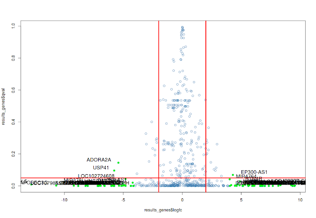
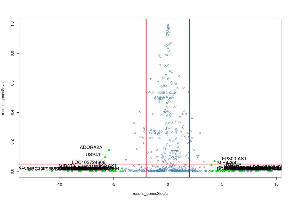
## volcano plot
# Filter genes by log fold change by 16 fold
fc_sig_results_genes=which(abs(results_genes$logfc)>4)
# Extract genes with fold change by 4 fold
fc_sig_results_genes_plot=results_genes[fc_sig_results_genes,]
# plot
plot(results_genes$logfc,results_genes$qval, col="steelblue", pch=1)
#abline
abline(v=c(2,-2), col="red", lwd=3)
abline(h=0.05, col="red",lwd=3)
# highlight the genes with color
points(fc_sig_results_genes_plot$logfc,fc_sig_results_genes_plot$qval, col="green", pch=16)
# label the significant genes
textxy(fc_sig_results_genes_plot$logfc,fc_sig_results_genes_plot$qval, labs=fc_sig_results_genes_plot$id, cex=1.2)
## In general, high density plots are misleading. Hence data scientists use ## ## density plots of differentially expressed genes:
colors = colorRampPalette(c("white", "blue","red","green","yellow"))
par(mfrow=c(1,2))
plot(x,y)
smoothScatter(x,y, colramp = colors)

## write the results to the file after filtering by p value <0.05, fold change (by 4 fold). Then sort the genes by p-value.
# Identify the genes (rows) below p-value 0.05
sigpi = which(results_genes[,"pval"]<0.05)
# Extract p-significant genes in a separate object
sigp = results_genes[sigpi,]
# Identify the statistically significant genes (rows) that are upregulated/ ##
## downregulated by 4 fold
sigde = which(abs(sigp[,"logfc"]) >= 2)
# Extract and store the statistically significant genes (rows) that are upregulated/ downregulated by 4 fold
sig_tn_de = sigp[sigde,]
# Order by q value, followed by differential expression
sorted_sig_tn_de = order(sig_tn_de[,"qval"], -abs(sig_tn_de[,"logfc"]), decreasing=FALSE)
# Extract the columns of interest (gene id, fold change, log fold change, p-value and adjusted p-value) from the sorted list.
output = sig_tn_de[sorted_sig_tn_de,c("id","fc","pval","qval","logfc")]
write.table(output, file="ballgown/SigDE.txt", sep="\t", row.names=FALSE, quote=FALSE)
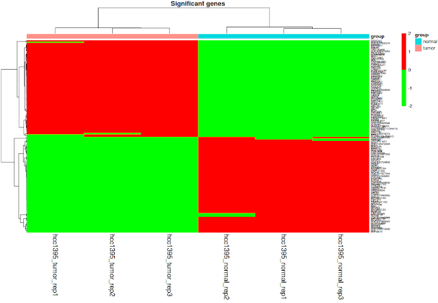
## heatmap
# Extract gene expression values using significant genes
sig_gene_expression=gene_expression[rownames(gene_expression) %in% sig_tn_de$id,]
# Add vertical cut offs
abline(v=c(-2,2), col="black", lwd=2, lty=2)
# Add legend. Remember fold changes are logged (2 base)
legend("topright", "Fold change >4 and <-4", lwd=2, lty=2)

## correlation plot between tumor and normal samples. Average expression of Normal samples Vs Average expression of Tumor samples
# Convert the matrix to data
gene_expression=as.data.frame(gene_expression)
#write.table(gene_expression, "gene_expression.txt", sep="\t")
# create normal means column
gene_expression$normal=rowMeans(gene_expression[,c(1:3)])
# create tumor means column
gene_expression$tumor=rowMeans(gene_expression[,c(4:6)])
# to avoid log 0, add 1 to log values. FPKM values are not normalized
x=log2(gene_expression[,"normal"]+1)
y=log2(gene_expression[,"tumor"]+1)
plot(x=x, y=y, pch=1, cex=2, xlab="Normal FPKM (log2)", ylab="Tumor (log2)", main="Tumor vs Normal FPKMs")
abline(a=0, b=1)
# Add statistically significant genes to the plot in green color
xqsig=x[qsig]
yqsig=y[qsig]
points(x=xqsig, y=yqsig, col="green", pch=19, cex=2)

## Identify significant genes by fold change (genes changed by 16 fold - 2^4).
## note that these genes are already filtered by adjusted p-value (q-value). In ## this step we are plotting statistically significant genes (with q-value <0.05) ## upregulated by 16 fold and downregulated by 16 fold.
fsig=which(abs(results_genes$logfc)>4).
xfsig=x[fsig]
yfsig=y[fsig]
points(x=xfsig, y=yfsig, col="red", pch=1, cex=2)
## legend
legend_text = c("Significant by Q value", "Significant by Fold change")
legend("topright", legend_text,bty="n",pch = c(19,19), col=c("green","red"))
# label the significant genes
textxy(xfsig,yfsig, cex=0.8, labs=row.names(gene_expression[fsig,]))

# add red line through 0
abline(v=0, col="red", lwd=3)
# add red line through fold change 4 (log2,2)
abline(v=c(4,-4), col="red", lwd=3)
abline(h=c(-4,4), col="red",lwd=3)
## volcano plot
# Filter genes by log fold change by 16 fold
fc_sig_results_genes=which(abs(results_genes$logfc)>4)
# Extract genes with fold change by 4 fold
fc_sig_results_genes_plot=results_genes[fc_sig_results_genes,]
# plot
plot(results_genes$logfc,results_genes$qval, col="steelblue", pch=1)
#abline
abline(v=c(2,-2), col="red", lwd=3)
abline(h=0.05, col="red",lwd=3)
# highlight the genes with color
points(fc_sig_results_genes_plot$logfc,fc_sig_results_genes_plot$qval, col="green", pch=16)
# label the significant genes
textxy(fc_sig_results_genes_plot$logfc,fc_sig_results_genes_plot$qval, labs=fc_sig_results_genes_plot$id, cex=1.2)
## In general, high density plots are misleading. Hence data scientists use ## ## density plots of differentially expressed genes:
colors = colorRampPalette(c("white", "blue","red","green","yellow"))
par(mfrow=c(1,2))
plot(x,y)
smoothScatter(x,y, colramp = colors)

## write the results to the file after filtering by p value <0.05, fold change (by 4 fold). Then sort the genes by p-value.
# Identify the genes (rows) below p-value 0.05
sigpi = which(results_genes[,"pval"]<0.05)
# Extract p-significant genes in a separate object
sigp = results_genes[sigpi,]
# Identify the statistically significant genes (rows) that are upregulated/ ##
## downregulated by 4 fold
sigde = which(abs(sigp[,"logfc"]) >= 2)
# Extract and store the statistically significant genes (rows) that are upregulated/ downregulated by 4 fold
sig_tn_de = sigp[sigde,]
# Order by q value, followed by differential expression
sorted_sig_tn_de = order(sig_tn_de[,"qval"], -abs(sig_tn_de[,"logfc"]), decreasing=FALSE)
# Extract the columns of interest (gene id, fold change, log fold change, p-value and adjusted p-value) from the sorted list.
output = sig_tn_de[sorted_sig_tn_de,c("id","fc","pval","qval","logfc")]
write.table(output, file="ballgown/SigDE.txt", sep="\t", row.names=FALSE, quote=FALSE)
## heatmap
# Extract gene expression values using significant genes
sig_gene_expression=gene_expression[rownames(gene_expression) %in% sig_tn_de$id,]
#remove tumor and normal columns
sig_gene_expression=sig_gene_expression[,-c(7:8)]
sig_gene_expression=sig_gene_expression[,-c(7:8)]
# for pheatmap function, column names and row names of data and pdata mush be identical# change the row names
rownames(phenotype_table)=phenotype_table[,1]
# remove the id column
phenotype_table=subset(phenotype_table, select = -c(id) )
# change the colnames to match with the sample names
colnames(sig_gene_expression)=row.names(phenotype_table)
# draw heatmap
library(pheatmap)
pheatmap(as.matrix(sig_gene_expression), scale = "row", clustering_distance_rows = "correlation", clustering_method = "complete",annotation_col = phenotype_table , main="Significant genes",fontsize_col=14, fontsize_row = 6 ,color = c("green","red"))
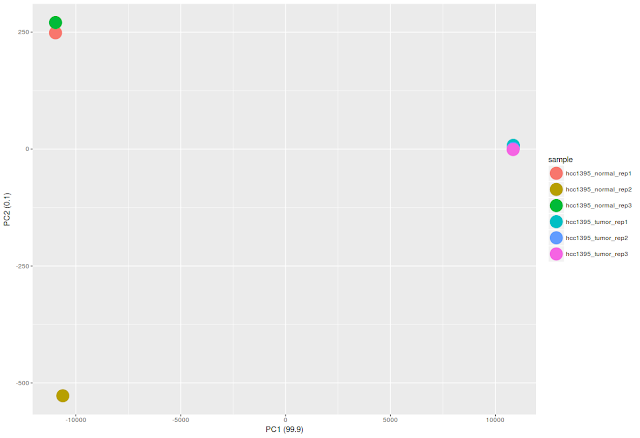
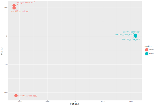
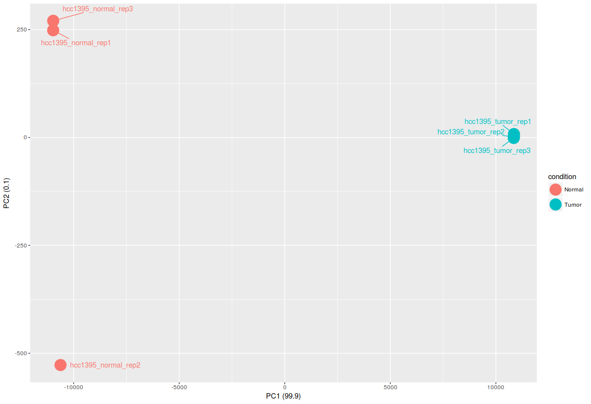
## Draw PCA plot
# transpose the data and compute principal components
pca_data=prcomp(t(sig_gene_expression))
# Calculate PCA component percentages
pca_data_perc=round(100*pca_data$sdev^2/sum(pca_data$sdev^2),1)
# Extract 1 and 2 principle components and create a data frame with sample names, first and second principal components and group information
df_pca_data = data.frame(PC1 = pca_data$x[,1], PC2 = pca_data$x[,2], sample = colnames(sig_gene_expression), condition = rep(c("Normal","Tumor"),each=3))
## We will use ggplot2 and ggrepel packages to draw the PCA plots.
# color by sample
library(ggplot2)
library(ggrepel)
ggplot(df_pca_data, aes(PC1,PC2, color = sample))+
geom_point(size=8)+
labs(x=paste0("PC1 (",pca_data_perc[1],")"), y=paste0("PC2 (",pca_data_perc[2],")"))
# color by condition/group
ggplot(df_pca_data, aes(PC1,PC2, color = condition))+
geom_point(size=8)+
labs(x=paste0("PC1 (",pca_data_perc[1],")"), y=paste0("PC2 (",pca_data_perc[2],")"))+
geom_text_repel(aes(label=sample),point.padding = 0.75)
# save the whatever you have done so far
save.image("bg.rda")
# Load the saved work place in case you want to add more analysis.
load("bg.rda")
=========================================
rownames(phenotype_table)=phenotype_table[,1]
# remove the id column
phenotype_table=subset(phenotype_table, select = -c(id) )
# change the colnames to match with the sample names
colnames(sig_gene_expression)=row.names(phenotype_table)
# draw heatmap
library(pheatmap)
pheatmap(as.matrix(sig_gene_expression), scale = "row", clustering_distance_rows = "correlation", clustering_method = "complete",annotation_col = phenotype_table , main="Significant genes",fontsize_col=14, fontsize_row = 6 ,color = c("green","red"))

## Draw PCA plot
# transpose the data and compute principal components
pca_data=prcomp(t(sig_gene_expression))
# Calculate PCA component percentages
pca_data_perc=round(100*pca_data$sdev^2/sum(pca_data$sdev^2),1)
# Extract 1 and 2 principle components and create a data frame with sample names, first and second principal components and group information
df_pca_data = data.frame(PC1 = pca_data$x[,1], PC2 = pca_data$x[,2], sample = colnames(sig_gene_expression), condition = rep(c("Normal","Tumor"),each=3))
## We will use ggplot2 and ggrepel packages to draw the PCA plots.
# color by sample
library(ggplot2)
library(ggrepel)
ggplot(df_pca_data, aes(PC1,PC2, color = sample))+
geom_point(size=8)+
labs(x=paste0("PC1 (",pca_data_perc[1],")"), y=paste0("PC2 (",pca_data_perc[2],")"))

# color by condition/group
ggplot(df_pca_data, aes(PC1,PC2, color = condition))+
geom_point(size=8)+
labs(x=paste0("PC1 (",pca_data_perc[1],")"), y=paste0("PC2 (",pca_data_perc[2],")"))+
geom_text_repel(aes(label=sample),point.padding = 0.75)
# save the whatever you have done so far
save.image("bg.rda")
# Load the saved work place in case you want to add more analysis.
load("bg.rda")
=========================================