Transcriptomics has evolved over the years from isolated, targeted genes to enmasse studies of transcripts. This allowed scientists not only to study the transcriptome it self, but it's dynamics. One of the enmasse technologies that led the revolution is array based technology that realized the dreams of scientist to study entire transcriptome in it's context. Currently, NGS based technologies replaced use of arrays. However, this is limited labs with enough grants and probably established labs. There are several labs still using microarrays to study transcriptome. Transcritomic microarrays are largely classified into 2 categories: 3' IVT arrays and Exon arrays. 3'IVT arrays dominated early where as exon arrays slowly took over 3' IVT arrays. Information from exon arrays is multifold compared to 3' IVT microarrays. It is interesting to note that Affymetrix dominated early market (esp 3' IVT market), late entrant Illumina took over the market esp from exon arrays onwards and consolidated its position with SNP (genomic) chips and NGS technologies.
In this note, analysis of GSE-45161 (HGU133plus2 human chip) data analysis would be presented. User can download the data from here or user can download the data in to R directly, following this note. HGU133plus2 is produced and marketed by Affymetrix. We will use limma in R/Bioconductor for analysis. Please note following information:
Following is the typical analysis of microarray data:
 Analysis can be largely broken down into 4 stages as explained below:
- Example files used in the workflow are arbitrarily taken to demo the workflow
- Analysis results from the example workflow are mostly unscientific and cannot be used in scientific deduction from this analysis
Following is the typical analysis of microarray data:

- Raw files
- Quality check
- Data analysis
Please note that three normalized methods (RMA, GCRMA and VSN) in this note. However, subsequent analysis use GCRMA treated data. User can use any one of the above 3 methods. This was done as I observed discrepancies in their clustering, post normalization.
- Functional analysis
Functional analysis involves identification of significant genes, GO analysis, pathway analysis, network analysis, Interaction networks etc. In this note, we present, GO enrichment as example.
After downloading the data either using browser or R as mentioned above, run the following script. Please keep the files in a folder titled "gse45161" in the same directory or change the code as per your raw files location and download the sample description file here and save it as tsv with name "GSE45161.csv". If you are using Rstudio, image command may throw an error saying that figure margins are too large. Try to clear existing plots or expand the plots window. :
###########################################
#######R script starts here######################
############################################
library(affy)library(gcrma)
library(limma)
library(treemap)
library(gplots)
library(simpleaffy)
library(RColorBrewer)
library(hgu133plus2.db)
library(treemap)
library(vsn)
library(GO.db)
#load("gse45161.Rdata")
ls()
getwd()
#setwd("/wine/gse45161/")
###read experimental data
samples.cel=data.frame(read.delim2("GSE45161.csv", row.names = 2, sep="\t", header=TRUE))
### sort row names (sample names)
samples.cel=samples.cel[sort(row.names(samples.cel)),]
#samples.cel
### load cel files and store as object
GSE45161.cel=ReadAffy(filenames = row.names(samples.cel))
#colnames(GSE45161.cel)
# ## Regenerate raw images
png("GSE45161.raw.png")
par(mfrow=c(2,5))
image(GSE45161.cel)
dev.off()
# ## Quality control####
qc.GSE45161.cel=qc(GSE45161.cel)
# ## Plot quality controls
png("GSE45161.cel.qc.png",width=1366, height=768)
plot(qc.GSE45161.cel)
dev.off()
### Plot quality controls with mid probes
png("GSE45161.cel.qc.mid.png", width=1366, height=768)
plot(qc.GSE45161.cel, usemid=T, type=c)
dev.off()
## RNA degradation
rnadeg.GSE45161=AffyRNAdeg(GSE45161.cel)
cols=1:10
png("GSE45161.rnadeg.png", width=1366, height=768)
plotAffyRNAdeg(rnadeg.GSE45161,cols =cols )
legend("topleft", box.col = c(1,2), legend=samples.cel$Name,col=cols, lty=1, y.intersp =1, cex=2, xjust = 0)
dev.off()
## Histograms for raw data
png("GSE45161.hist.png", width=1366, height=768, res=90)
hist(GSE45161.cel)
legend("topright", box.col = c(1,2), legend=samples.cel$Name,col=cols, lty=1, y.intersp =1, cex=2, xjust = 0)
dev.off()
### Normalize (GCRMA) cel files
gc.GSE45161=gcrma(GSE45161.cel)
rma.GSE45161=rma(GSE45161.cel)
vsn.GSE45161=vsnrma(GSE45161.cel)
# Plot meanSD plot for VSN normalized values
#class(vsn.GSE45161)
png("vsn.meansd.png")
meanSdPlot(vsn.GSE45161)
dev.off()
### check if samples names are same between normalized values and samples
all(colnames(gc.GSE45161)==rownames(samples.cel))
### Store the condition
condition=samples.cel$Target
class(condition)
### design model matrix
design=model.matrix(~0+condition)
colnames(design)
colnames(design)=c("Avastin","control")
design
### Fit to a model - linear model
fit=lmFit(gc.GSE45161,design)
names(fit)
fit$design
### make contrasts
cm=makeContrasts(Avastin-control,levels=design)
#### contrast fit
cmfit=contrasts.fit(fit, cm)
# ebayes fit
ecmfit=eBayes(cmfit)
names(ecmfit)
#MA plot
png("gse45161_maplot.png", width=1366, height=768)
plot(ecmfit$Amean, ecmfit$coefficients[,1], cex=0.3, col="blue")
dev.off()
### volcano plot
png("gse45161_volcanoplot.png", width=1366, height=768)
plot (ecmfit$coefficients[,1], -log10(ecmfit$p.value[,1]), pch=20, cex=0.3)
dev.off()
### boxplot
png("gse45161_boxplot_before_after.png", width=1366, height=768)
par(mfrow=c(1,2))
boxplot(GSE45161.cel, main="Before normalization", las=3, names=samples.cel$Name, notch=TRUE, cex.axis=0.7)
boxplot(data.frame(exprs(gc.GSE45161)), main="After normalization", las=3, names=samples.cel$Name, notch=TRUE, cex.axis=0.7)
dev.off()
## write to HDD
write.fit(ecmfit, file="fitted_expression.txt", method = "separate")
write.table(as.data.frame(ecmfit), file="gse45161_expression.txt", sep="\t")
#####Extract genes/probes of interest
# filter probes intensity >6 and fold change > 2 or <-2
afc.ecmfilt=ecmfit[subset(ecmfit$Amean> 6 & abs(ecmfit$coefficients)> 2),]
#class(afc.ecmfilt)
#names(afc.ecmfilt)
#pecmfilt$Amean
#MA plot of total and highlight genes with fold change of 2 and A >6
# MA plot for ebayes fit probes
plot (ecmfit$Amean, ecmfit$coefficients, cex=0.3, xlab="Intensity change (log)", ylab="Fold change (log)")
# high light genes of intereste
points(afc.ecmfilt$Amean, afc.ecmfilt$coefficients, col="red")
dev.off()
### volcano plot
# Volcano plot for ebayes fit probes (foldchange Vs P value)
png("volcano.png")
plot (ecmfit$coefficients, -log10(ecmfit$p.value), pch=20, cex=0.3, xlim=c(3,-3), xlab= "Fold change (log)", ylab="P value (-log10P)")
points (afc.ecmfilt$coefficients, -log10(afc.ecmfilt$p.value), pch=20,xlim=c(3,-3), col="green")
dev.off()
#############################################
#####clutering###############################
#############################################
### clustering of gcrma normalized data
dat=exprs(gc.GSE45161)
dist.dat=dist(t(dat))
hc.dist.dat=hclust(dist.dat, method="complete")
png("gc.clustering.png")
plot(hc.dist.dat, labels=paste0(samples.cel$Name, sep=",", samples.cel$Target))
dev.off()
### clustering of RMA normalized data
rma.dat=exprs(rma.GSE45161)
rma.dist.dat=dist(t(rma.dat))
#image(as.matrix(rma.dist.dat))
rma.hc.dist.dat=hclust(rma.dist.dat, method="complete")
png("rma.clustering.png")
plot(rma.hc.dist.dat, labels=paste0(samples.cel$Name, sep=",", samples.cel$Target))
dev.off()
### clustering of vsn normalized data
vsn.dat=exprs(vsn.GSE45161)
vsn.dist.dat=dist(t(vsn.dat))
#image(as.matrix(vsn.dist.dat))
vsn.hc.dist.dat=hclust(vsn.dist.dat, method="complete")
png("vsn.clustering.png")
plot(vsn.hc.dist.dat, labels=paste0(samples.cel$Name, sep=",", samples.cel$Target))
dev.off()
###############################################
# Use hgu133plus2 db for extracting information
##############################################
probes=row.names(ecmfit)
head(probes)
### using hgu133plus2.db
columns(hgu133plus2.db)
# Extract probe positions, gene symbol, pathway information
mapping=select(hgu133plus2.db, keys=probes,columns=c("PROBEID", "CHRLOC", "CHRLOCEND","SYMBOL"), keytype ="PROBEID")
head(mapping)
dim(mapping)
pruned.mapping=na.omit(mapping[grep('un|ssto|hap|random',mapping$CHRLOCCHR, invert = TRUE, ignore.case = TRUE),])
#######################
# Further processing-- Annotation
########################
#Merge probes and data set
mecmfit=merge(ecmfit,pruned.mapping, by.x=0, by.y="PROBEID")
head(mecmfit)
dim(mecmfit)
## Change column names for better understanding
colnames(mecmfit)[c(1,2,13:17)]=c("Probe","FoldChange", "F.p.value", "START", "CHR", "END", "SYMBOL" )
### reorder columns
mecmfit=mecmfit[,c(1,2,17,15,14,16,3:13)]
head(mecmfit)
### sort by chromosome and position
ormecmfit=mecmfit[order(mecmfit$CHR, abs(mecmfit$START), decreasing = FALSE),]
ormecmfit$CHR=as.factor(ormecmfit$CHR)
dim(ormecmfit)
write.table(ormecmfit, "foldchange.txt", sep="\t", row.names =F)
dim(unique(ormecmfit))
### filter probeset with more than 2 fold change
fc.ormecmfit=ormecmfit[abs(ormecmfit$FoldChange)>2,]
#View(fc.ormecmfit)
# Extract probe sets with 1.5 FC across all the chips
f_ormecmfit=subset(ormecmfit, abs(ormecmfit$FoldChange)>1.5)
dim(f_ormecmfit)
tm.uf_ormecmfit=f_ormecmfit[,c(1,2,3,14)]
dim(tm.uf_ormecmfit)
# Unique probesets
utm.uf_ormecmfit=unique(tm.uf_ormecmfit, by=tm.uf_ormecmfit$Probe)
#dim(utm.uf_ormecmfit)
#class(utm.uf_ormecmfit)
#View(utm.uf_ormecmfit)
### treemap
png("treemap.png")
treemap(utm.uf_ormecmfit, index=c("SYMBOL"), type="index", vSize ="p.value", vColor ="FoldChange" , palette ="RdGy")
dev.off()
??aafTableAnn
##GO
go.utm.uf_ormecmfit=select(hgu133plus2.db, utm.uf_ormecmfit$Probe, "GO", "PROBEID")
go.term.utm.uf_ormecmfit= select(GO.db, go.utm.uf_ormecmfit$GO,"TERM","GOID")
#### Probes per chromosome and store in a data frame
# table(ormecmfit$CHR)
df.ormecmfit=as.data.frame(table(ormecmfit$CHR))
## Plot frequency of probes per chromosome
png("hist_perchromosome.png")
barplot(df.ormecmfit$Freq, xlab="Chromosomes", names.arg=df.ormecmfit$Var1, ylab="Probset number")
dev.off()
#save.image("gse45161.Rdata")
################################################################
####script ends######################
########################################################
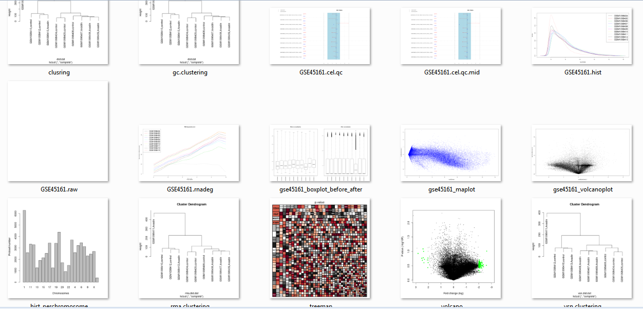
Few images derived out of analysis are collated below: